


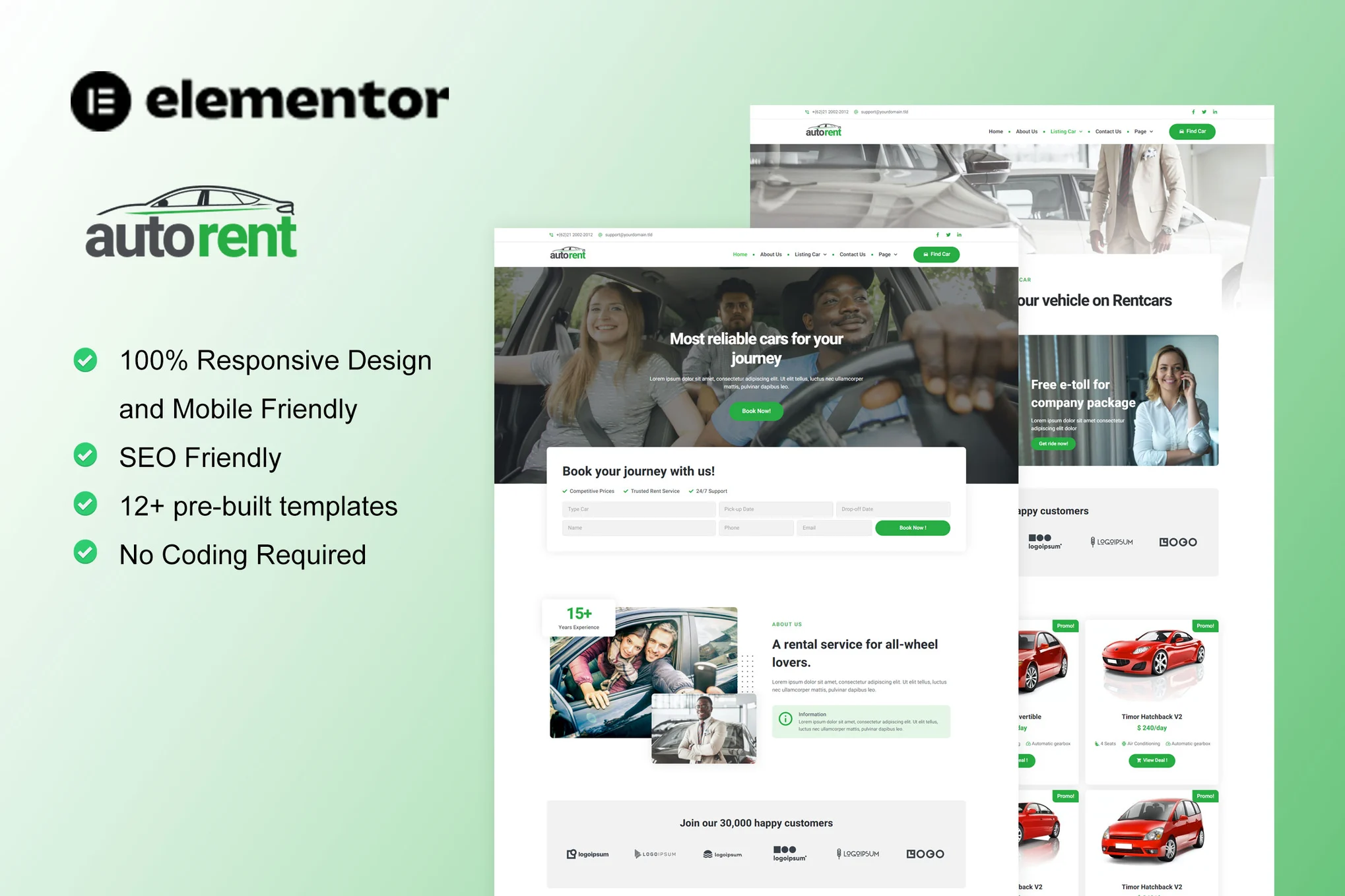
Astra The theme is built with powerful responsive editing features that can help web designers and developers easily adjust the layout of the site to make it perfect on different devices such as desktops, tablets and cell phones.
![图片[1]-Astra 主题响应式设计指南:优化网站在不同设备上的显示效果](https://www.361sale.com/wp-content/uploads/2025/03/20250301205456881-image.png)
What is Responsive Design?
Responsive design refers to automatically adapting the layout and content of a web page to the screen size and resolution of different devices. Instead of creating multiple versions of your website, you can use responsive design techniques to ensure that your content displays smoothly on all devices, and the Astra theme is designed for this purpose. The Astra theme is designed for this purpose. Astra Responsive editing tools are provided to easily manage the performance of the website at different screen sizes.
![图片[2]-Astra 主题响应式设计指南:优化网站在不同设备上的显示效果](https://www.361sale.com/wp-content/uploads/2025/03/20250301211354500-image.png)
Responsive Editing Features of Astra Theme
1. Preview and edit designs for different devices
Astra The theme provides a device preview function, you can directly view the effect of desktop, tablet and cell phone in the editing process. The specific steps are as follows:
- Go to the Astra Customizer and select the settings you need to edit.
- Find the Responsive Editing icon and switch the device view: desktop, tablet, or mobile.
![图片[3]-Astra 主题响应式设计指南:优化网站在不同设备上的显示效果](https://www.361sale.com/wp-content/uploads/2025/03/20250303095100721-image.png)
- Adjust the appropriate settings in each device view to ensure that the website is optimized for display on different devices.
2. Responsive Design Setup
pass (a bill or inspection etc) Astra The theme's customizer supports responsive editing for almost all settings. Specifically included:
- Font size and color: Set different font sizes and colors for each device to ensure the reading experience.
- Border colors and styles: Adjusting different border styles and colors based on device type makes the site look sophisticated and design-compliant on every screen.
- Icon size, color and spacing: Icon settings can be adjusted individually for each device to ensure that icons are visible on all types of screens.
- Background colors, overlays and images: Customize different background effects for each device type to enhance the visual hierarchy.
- Inside and Outside Margins: The internal and external spacing may vary from device to device, and you can set different spacing for each device to make the content layout more refined.
![图片[4]-Astra 主题响应式设计指南:优化网站在不同设备上的显示效果](https://www.361sale.com/wp-content/uploads/2025/03/20250303095550153-image.png)
![图片[5]-Astra 主题响应式设计指南:优化网站在不同设备上的显示效果](https://www.361sale.com/wp-content/uploads/2025/03/20250303095744422-image.png)
3. Responsive design using relative units
One of the keys to responsive design is choosing the right size units.Astra Three commonly used units are supported: PX (pixels), EM (relative units) and % (percentage). The choice of these units directly affects how web elements are displayed on different devices:
- PX (pixels): Suitable for precise size control, usually used in desktop design, but may cause elements to go out of display range on small screens.
- EM (relative units): Relates to the font size of the parent element and is suitable for elements that need to be dynamically adjusted, such as button or heading sizes.
- % (percentage): Relates to the dimensions of the parent element and applies to adjusting the width or height of the layout element.
![图片[6]-Astra 主题响应式设计指南:优化网站在不同设备上的显示效果](https://www.361sale.com/wp-content/uploads/2025/03/20250303095845929-image.png)
Through the skillful use of these units, you can ensure that you get the right layout and display on both desktop and mobile devices.
Responsive Header & Footer for Astra Theme
Responsive design is not just for page content.Astra The theme's header and footer also support customization based on device type. Here are some common responsive tweaks:
- Adjust Logo Width: Set different logo widths for desktop and mobile devices to ensure the right size is displayed on each device.
![图片[7]-Astra 主题响应式设计指南:优化网站在不同设备上的显示效果](https://www.361sale.com/wp-content/uploads/2025/03/20250303100050369-image.png)
- Fonts and colors for headlines and banners: Setting different font sizes and colors for different device types makes the site's brand identity more prominent.
![图片[8]-Astra 主题响应式设计指南:优化网站在不同设备上的显示效果](https://www.361sale.com/wp-content/uploads/2025/03/20250303100559332-image.png)
- Height of header and footer: The height of the header and footer can be adjusted to fit different screen sizes depending on the type of device. ,,
- Add different widgets: Different widgets can be added or hidden depending on the device type, such as displaying simplified navigation menus or social media links on mobile devices.
![图片[9]-Astra 主题响应式设计指南:优化网站在不同设备上的显示效果](https://www.361sale.com/wp-content/uploads/2025/03/20250303101123285-image.png)
- Element reorganization and repositioning: Elements in the header and footer can be rearranged on mobile devices, such as moving the main menu to the bottom of the page or hiding certain icons to enhance the user experience on mobile.
Hidden Elements in Responsive Design
Users can use theAstra The theme hides certain elements during responsive editing. For example, you can selectively hide certain content or layout elements based on device type:
- exist Header Builder maybe Footer Builder in which you can configure the elements to be shown or hidden individually for each device view.
- For example, you can choose to hide certain large icons or complex menu items on mobile devices to simplify the layout of the page.
![图片[10]-Astra 主题响应式设计指南:优化网站在不同设备上的显示效果](https://www.361sale.com/wp-content/uploads/2025/03/20250303101603550-image.png)
concluding remarks
Astra The responsive design features of the theme make the website perform better on multiple devices. Through reasonable adjustment and optimization, it can improve the aesthetics of the page and also ensure the consistency of the user experience when browsing on different devices.

Link to this article:https://www.361sale.com/en/35352/The article is copyrighted and must be reproduced with attribution.


![表情[wozuimei]-光子波动网 | WordPress教程、Elementor教程与故障修复](https://www.361sale.com/wp-content/themes/zibll/img/smilies/wozuimei.gif)
![表情[baoquan]-光子波动网 | WordPress教程、Elementor教程与故障修复](https://www.361sale.com/wp-content/themes/zibll/img/smilies/baoquan.gif)

 简体中文
简体中文  English


No comments