


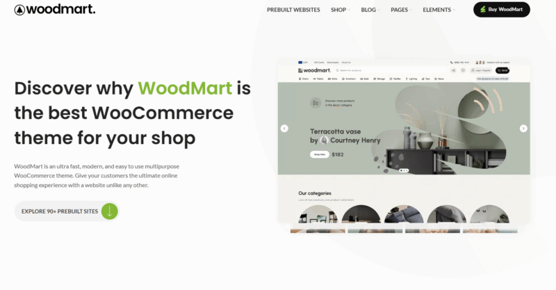
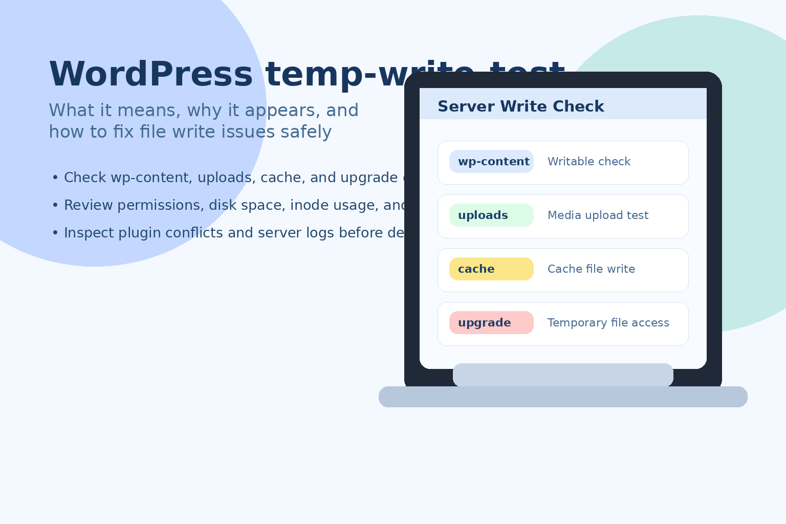
E-commerce websites have a poor experience on cell phones, and that customer will only be quietly lost. Despite the choice of a powerful WooCommerce Themes Woodmart has the conditions to build a good mobile foundation, but if you want users to be really "willing to order on the phone", you still need to polish the details in place. This article will bring 5 practical optimization suggestions to fully explore the potential of Woodmart in the mobile terminal, improve user experience and conversion results.
![Image [1] - Don't let your customers run away on your cell phone! Do these 5 steps with Woodmart and doubling your orders is not a dream!](https://www.361sale.com/wp-content/uploads/2025/07/20250728161937738-image.png)
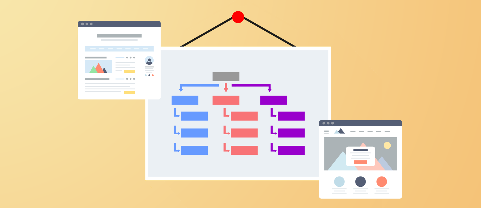
I. Enabling mobile-specific menus
Woodmart theme comes with built-inresponsiveMenu functionality that allows for clean, intuitive menu navigation for cell phones individually.
Optimization Recommendations:
- Woodmart > Theme Settings > General > Mobile bottom navbaer
- set upHome, Favorites, Shopping CartIcons, etc;
- Ensure that there are no more than 5 menus at the first level, avoid stacking, and it is recommended to hide unnecessary page links.
Purpose:
Ensure that mobile users can quickly browse categories, search for products, and view shopping carts without being distracted by complex structures.
![Image [2] - Don't let your customers run away on your cell phone! Do these 5 steps with Woodmart and doubling your orders is not a dream!](https://www.361sale.com/wp-content/uploads/2025/07/20250728163206637-image.png)
Second, using Ajax scrolling load or paging loading
In the mobile network environment, long pages are prone to slow loading or lagging operation.Woodmart offers Ajax Infinite Scroll Load respond in singing Click to load more option, which can effectively optimize the loading speed and experience.
![Image [3] - Don't let your customers run away on your cell phone! Do these 5 steps with Woodmart and doubling your orders is not a dream!](https://www.361sale.com/wp-content/uploads/2025/07/20250728192517986-image.png)
Set the path:
Woodmart >Theme Settings > Shop > Pagination Type
![Image [4] - Don't let your customers run away on your cell phone! Do these 5 steps with Woodmart and doubling your orders is not a dream!](https://www.361sale.com/wp-content/uploads/2025/07/20250728164909422-image.png)
Recommended Option:
- "Load more" button or infinite scroll"
![Image [5] - Don't let your customers run away on your cell phone! Do these 5 steps with Woodmart and doubling your orders is not a dream!](https://www.361sale.com/wp-content/uploads/2025/07/20250728165118749-image.png)
Purpose:
Make the merchandise listings load more smoothly on the mobile side to improve browsing efficiency.
Third, commodity picture adaptive and lazy loading
Mobile space is limited, the image size needs to be adapted to the screen width, while to avoid lagging, the lazy loading function should be enabled.
Optimization Recommendations:
- exist Theme Settings > Performance Enable Lazy Load image loading in the
![Image [6] - Don't let your customers run away on your cell phone! Do these 5 steps with Woodmart and doubling your orders is not a dream!](https://www.361sale.com/wp-content/uploads/2025/07/20250728165946360-image.png)
- Ensure that images are in WebP format to reduce bandwidth consumption;
Purpose:
Accelerate the page opening speed, while guaranteeing the effect of the picture display.
IV. Optimizing the checkout process
Mobile users have less patience, and the simpler the checkout process, the better. woodmart's default checkout page supports a one-page process, but there are further optimizations you can make:
Optimization approach:
- Use plug-ins such as Checkout Field Editor Streamlining of fields (e.g., removal of "company name", "additional information")
- exist WooCommerce > Settings > Accounts & Privacy Turn on "Allow Visitors to Checkout" in the
![Image [7] - Don't let your customers run away on your cell phone! Do these 5 steps with Woodmart and doubling your orders is not a dream!](https://www.361sale.com/wp-content/uploads/2025/07/20250728182053380-image.png)
Purpose:
Reduce bounce rates and allow users to complete the payment process as quickly as possible.
V. Using fixed buttons to enhance the conversion path
Woodmart Allow fixed bottom buttons to be displayed on mobile.
Operation Path:
Theme Settings > Mobile Bottom Navigation
Optimization Recommendations:
- Show "Cart" + "Account" Layout
- WhatsApp or Messenger button if customer service is available
Purpose:
Always keep key conversion buttons visible to boost purchase conversions.
VI. Summary
Build with Woodmart WooCommerce Mall, functionality and appearance have a solid foundation, but can really make business, is the mobile shopping experience. As long as the menu layout, picture loading, page logic, checkout process, conversion button of these five key points to adjust, you can get rid of the "computer looks good, the phone is difficult to use" dilemma, so that the site in the mobile terminal is also smooth, good to buy, can be a deal.

Link to this article:https://www.361sale.com/en/70520/The article is copyrighted and must be reproduced with attribution.


![Emoji[wozuimei]-Photonflux.com | Professional WordPress repair service, worldwide, rapid response](https://www.361sale.com/wp-content/themes/zibll/img/smilies/wozuimei.gif)
![Emoticon[baoquan] - Photon Wave Network | Professional WordPress Repair Services, Worldwide Coverage, Rapid Response](https://www.361sale.com/wp-content/themes/zibll/img/smilies/baoquan.gif)

 简体中文
简体中文  English
  日本語
日本語  Français
  Español


No comments