


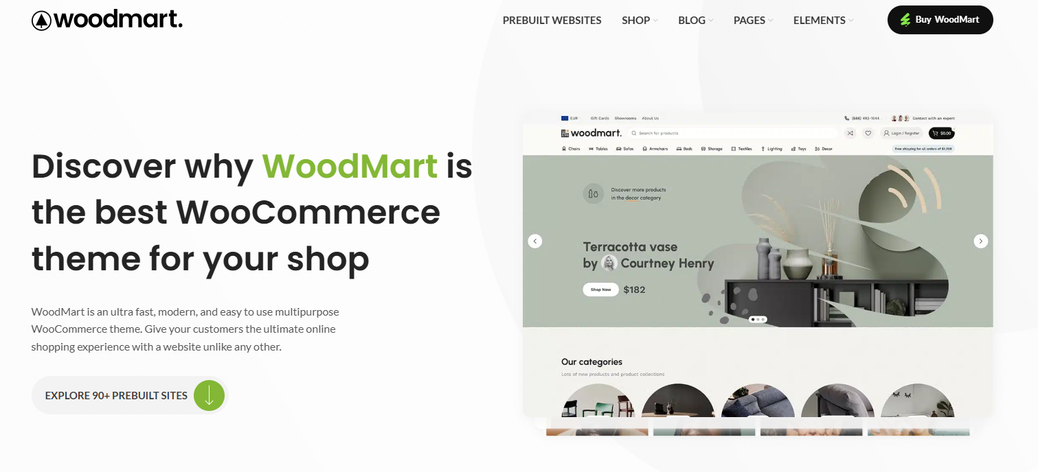
With more and more users shopping on their cell phones, the experience of e-commerce websites on the mobile side has become particularly important. The desktop design is great, but problems such as misalignment, lagging, and difficult buttons on the mobile side will also affect conversion.Woodmart Although responsive design, but to really do a good job of mobile experience, but also for the details of further optimization. In this article, we'll share how you can make your Woodmart site smoother and better on your phone through settings and layout adjustments.
![Image[1]-90% Website lost to this step in mobile! Woodmart Mobile Optimization Full Strategy Exposed](https://www.361sale.com/wp-content/uploads/2025/07/20250730140245325-image.png)
I. Switching to the mobile editing view
Whether you are using the Elementor Or Woodmart's own editor, which can be switched to mobile preview mode when building a page:
Steps in the Elementor editor:
- Go to page → Editing with Elementor
- Click on the device icon in the lower left corner (Responsive Mode)
- Select Mobile mode to see the display on your phone.
- misidentificationtext sizeSeparate settings for spacing, element alignment, etc.
![Image[2]-90% Website lost to this step in mobile! Woodmart mobile optimization full strategy exposure!](https://www.361sale.com/wp-content/uploads/2025/07/20250730150013236-image.png)
II. Adjusting the order of columns and optimizing the content structure
Mobile users pay more attention to the information directly, the home page should prioritize the display of key information, such as:
- Banner simplicity (Banner height control of 300-400px is recommended)
- Recommended products, hot list advance display
- CTA buttons are always visible (e.g. "Buy Now"/"Contact Customer Service")
![Image [3]-90% Website lost to this step in mobile! Woodmart mobile optimization full strategy exposure!](https://www.361sale.com/wp-content/uploads/2025/07/20250730152617588-image.png)
- Reduction of redundant modulesor extra-long scrolling content
![Image [4]-90% Website lost to this step in mobile! Woodmart Mobile Optimization Full Strategy Exposed](https://www.361sale.com/wp-content/uploads/2025/07/20250730151138264-image.png)
When using Elementor, you can readjust the stacking order via the Column Order Settings without affecting the desktop layout.
III. Enabling mobile menus (hamburger menus)
Woodmart Provides a separate path for mobile menu settings:
Operation Path:
Backend → Appearance → Menus → Create Menu→Check Mobile Side Menu
Setting Recommendations:
- The menu level should not be too deep, it is recommended to have a maximum of two levels
- Add "My Account", "Shopping Cart", "Login" and other frequently used entrances.
![Image[5]-90% Website lost to this step in mobile! Woodmart Mobile Optimization Full Strategy Exposed](https://www.361sale.com/wp-content/uploads/2025/07/20250730153732581-image.png)
IV. Setting the Sticky Header
Mobile pages are long, it is recommended to keep the top menu bar or bottom action bar:
Sticky Header setting method:
- go into Woodmart → Header builder → Setting → Sticky header
- Check the box "Sticky header shadow"
![Image [6]-90% Website lost to this step in mobile! Woodmart mobile optimization full strategy exposure!](https://www.361sale.com/wp-content/uploads/2025/07/20250730154657741-image.png)
V. Streamline fonts and images to improve loading speeds
Small screen and limited traffic on mobile, resource optimization is recommended:
- The recommended fonts are the system default or a single Google Font
- Keep the image size within 800px and use WebP format.
- Enable lazy loading of images (Lazy Load)
- Install caching plugins (e.g. WP Rocket, LiteSpeed Cache)
VI. Conclusion
Woodmart ThemesIt supports responsive design, but in order to really bring a smooth experience on the mobile side, we still need to put more thought into the content layout, ease of operation and loading speed. Details in place, not only will users browse more smoothly, the conversion effect will also be enhanced.

Link to this article:https://www.361sale.com/en/71459/The article is copyrighted and must be reproduced with attribution.


![Emoji[wozuimei]-Photonflux.com | Professional WordPress repair service, worldwide, rapid response](https://www.361sale.com/wp-content/themes/zibll/img/smilies/wozuimei.gif)
![Emoticon[baoquan] - Photon Wave Network | Professional WordPress Repair Services, Worldwide Coverage, Rapid Response](https://www.361sale.com/wp-content/themes/zibll/img/smilies/baoquan.gif)

 简体中文
简体中文  English
  日本語
日本語  Français
  Español


No comments