


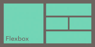
Flexbox LayoutModels have become a central tool in modern web design, and Elementor Container fully integrates their functionality into the visual editor. Understanding the fundamentals of Flexbox is a critical first step in mastering Elementor layout design.
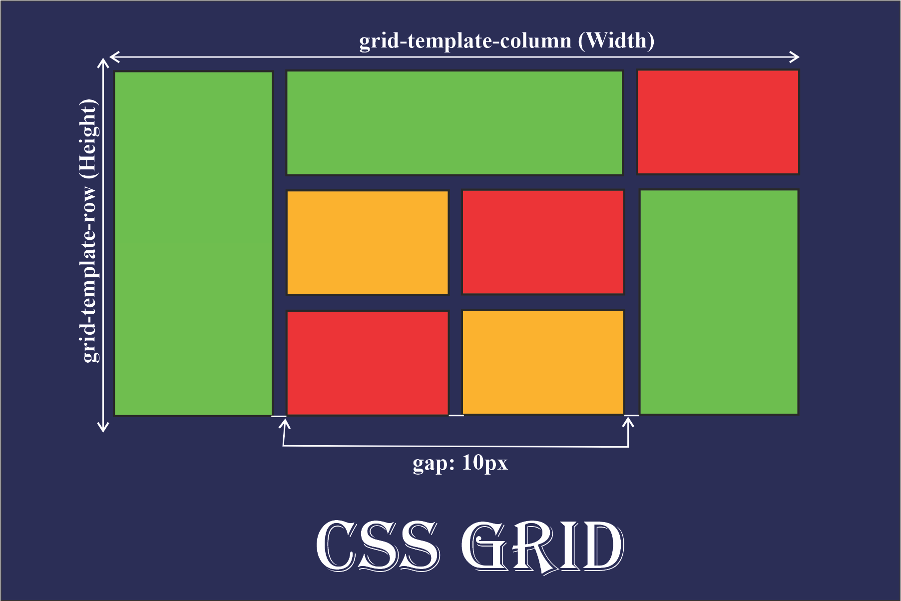
At the heart of Flexbox lies the concept of flexible containers and items. In Elementor, eachContainerThe default is the Flex container, and widgets added inside are automatically Flex items. This structure allows elements to be dynamically repositioned and sized according to the container dimensions.
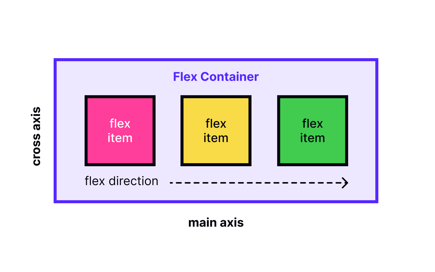
The main axis and cross-axis form the basis of Flexbox positioning.In Elementor's Container Settings panel, Flex Direction controls the direction of the main axis (horizontally or vertically), Justify Content manages the alignment of the main axis, and Align Items adjusts the alignment of the cross-axis. Together, these three properties determine the internal element alignment logic.
In-depth analysis of Container's Flex property
ElementorProvides full Flexbox control options for Container, with these settings spread across multiple submenus of the Layout tab.
Direction control (Flex Direction) supports four standard modes: Row (horizontal left to right), Row Reverse (horizontal right to left), Column (vertical top to bottom), Column Reverse (vertical bottom to top). In practice, the row layout is suitable for navigation menus and the column layout is suitable for content stacking on mobile devices.
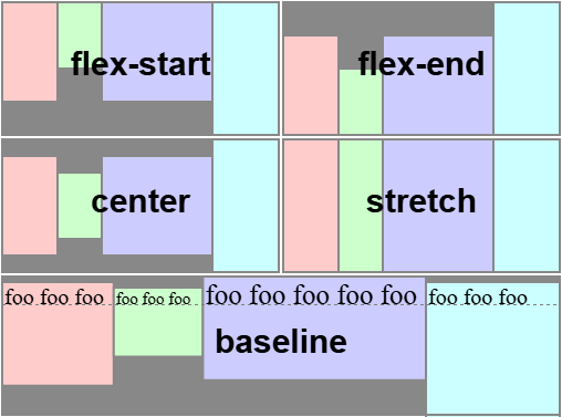
The alignment system consists of two dimensions: the spindle alignment (Justify Content) provides the6Options include Start Alignment, Center Alignment, End Alignment, Even Distribution, etc.; Cross-Axis Alignment (Align Items) offers4The options include stretch, start, center, and end. Using a combination of these options can create complex responsive layouts.
Hands-on: building responsivenavigation menu
Navigation menus are a typical application scenario for Flexbox layouts, and Elementor Container greatly simplifies the process.
To create horizontal navigation, first add Container and set the orientation to rows. Inside, place multiple navigation button widgets and use spacing to control the button intervals.Justify Content is set to center to get the traditional navigation effect, select the
The mobile adaptation requires adjusting the Flex Direction to columns so that the menu items stack vertically.Elementor's ResponsiveMode can directly set different Flex properties for different devices without writing media query code. Adding toggle buttons to control the menu display completes the complete responsive navigation system.
![图片[2]-Elementor Container的Flexbox功能详解:从入门到精通](https://www.361sale.com/wp-content/uploads/2025/05/20250513113833971-image.png)
high levelopening (chess jargon): Card Grid Design
Card layout is the mainstream design pattern of modern websites, and the combination of Flexbox and Elementor Container makes it incredibly easy to implement.
When creating a card container, enable theWrapoption allows content to be line-breaked. Set the appropriate Gap value to control card spacing and avoid layout problems caused by the use of outer margins.The Align Content property manages the overall vertical distribution of multi-row cards, usually choose Start or Center.
![图片[3]-Elementor Container的Flexbox功能详解:从入门到精通](https://www.361sale.com/wp-content/uploads/2025/05/20250517154652624-image.png)
Each card itself is also a nested Container, with the content organized internally using columnar Flexboxes. This "Flexbox nesting" technique allows for the construction of arbitrarily complex layout structures. To keep the height of the cards consistent, the Align Items are set to Stretch, and the internal elements are bottom-aligned using Margin Top:Auto.
Precise control of element spacing
Difficulty in managing element spacing in traditional layouts, Flexbox's gap feature completely solves this problem.
Elementor's Gap setting controls both row spacing and column spacing to the nearest pixel. In contrast to the traditional Margin method, Gap does not cause excess whitespace on edge elements, making the layout more stable and reliable.
Special spacing requirements can be realized by nesting Containers. For example, if you need a group of elements to be spaced 20px apart and another group to be spaced 10px apart, place them in separate containers and set their respective Gap values. This technique provides maximum flexibility while keeping the code clean.
Flex item sizes fordynamic (science)adapt
The scaling behavior of Flex items is one of the most powerful features of Flexbox, and Elementor provides an intuitive control interface.
Flex Grow controls the proportion of item expansion, when the container has space left, the item with the larger value gets more space.Flex Basis sets the initial size base, which can be set to a fixed number of pixels or a percentage.Flex Shrink defines the proportion of shrinking when there is not enough space.
In practice, the main content area usually sets Flex Grow to 1, and the sidebar to 0, so that the main content is prioritized for expansion. Image galleries can set a unified Flex Basis with Grow to achieve equal scaling and maintain visual consistency.
Element Sorting and Visual Rearrangement
Flexbox's order attribute breaksHTMLThe source code order is restricted and Elementor implements it visually.
Each widget has Order value setting in Advanced tab, default value is 0. Increase the value element backward, decrease the value element forward. This technology is particularly suitable for mobile layout adjustment, without modifying the HTML structure can be optimized for small screen display order.
Practical examples include displaying as image-title-text on desktop and adjusting to title-image-text on mobile. Simply set different Order values for different devices and Elementor handles the rest automatically. This rearrangement does not affect accessibility or SEO.
nestedAdvanced Applications of Flexbox
Complex layouts require multiple levels of nested Flexbox containers, and Elementor's Container system supports this structure perfectly. A typical three-column layout contains three levels of nesting: the outermost Horizontal Container (Direction Rows) contains three child Containers; the middle Vertical Container (Direction Columns) of the main content area contains headers and content; and the Sidebar Vertical Container contains multiple widgets. Each layer can set Flex properties independently.
Nesting techniques include: limiting the nesting depth to no more than 4 layers to avoid performance problems; adding a background color for each layer of the Container to temporarily differentiate between the boundaries; and using system naming conventions such as "outer - rows", "content - columns" and so on for ease of management.
Performance optimization and rendering efficiency
Although Flexbox layout is powerful, improper use can still lead to performance problems, Elementor provides a variety of optimization means.
hardware accelerationoption improves the performance of complex animations, enabled in the Container's advanced settings. Limit the number of rearrangement operations to avoid frequent layout recalculations caused by switching Flex Direction. Static content may be more efficient using CSS Grid, Elementor supports both layout modes.
Performance monitoring of developer tools shows thatOver-nesting increases rendering time. Best practice is to keep the structure flat and use nesting only when necessary. Periodically check layout efficiency using Elementor's performance analyzer.
straddleBrowser compatibilityprogrammatic
While modern browsers fully support Flexbox, some older versions require special handling, and Elementor has a variety of built-in compatibility options.
Automatic vendor prefixes ensure that properties work properly in engines such as Webkit, Ms. ForIE10/11The special syntax is automatically generated by the system without manual intervention. Layout degradation policy automatically enables simplified layouts when old browsers are detected.
For real-world testing, focus on checking Flex Wrap functionality in IE and Gap support in Safari; Elementor's preview mode includes a browser emulator for quick compatibility verification. When problems are found, alternate stylesheets can be loaded using conditional comments.
Debugging tips and common problem solving
Flexbox layouts can sometimes produce unexpected results, and it's vital to have a handle on debugging methods.
Elementor's real-time CSS inspector displays the application's Flex properties directly, helping to locate problems quickly. Common layout exceptions include: forgetting to set the container height causing vertical alignment to fail; Flex Basis conflicting with Width; and absolutely positioned child elements breaking the Flex context.
1) Verify that Container is set to Flex mode 2) Check for correct orientation 3) Verify alignment settings 4) Troubleshoot size conflicts 5) Check nested structure integrity. Documenting a library of common errors can speed up problem solving.
From Flexbox to CSS Grid for Joint Applications
Modern web design often requires Flexbox withCSS GridUsed in conjunction, Elementor supports seamless integration of both layout modes.
The overall framework uses Grid to create a stable structure, while the internal components use Flexbox for flexible content. For example, the entire page is laid out as a Grid, and each content area uses Flexbox to manage the internal elements.Elementor allows a mix of Container and traditional Section/Column on the same page.
Elementor's conversion tool can convert a simple Flexbox layout into a Grid structure with a single click.
Practical example: e-commerce product listings
Product listings for e-commerce websites demonstrate the typical advantages of Flexbox layouts, and Elementor provides professional solutions.
The list container sets the orientation to rows and allows for line breaks, and the Gap defines the product spacing. Each product card uses column orientation Flexbox to organize images, titles, prices and buttons.
Align Items: Stretch to keep card height consistent, button settings
Margin Top: Auto implements bottom alignment.
The filter bar uses a horizontal Flexbox layout with automatic spacing adjustment for filter criteria. Complex components such as price sliders also use Flexbox internally to manage child elements. Responsive design optimizes mobile display by adjusting Flex Direction and Order values.
Extended functionality and custom development
Elementor's Flexbox system supports deep extensions for advanced development needs.
Custom Flex properties can be added via CSS injection, such as different modes of Align Content.JavaScript APIFlex parameters can be dynamically modified to create interactive layout effects. Default Flex styles can be overridden in child themes to achieve a branded design system.
When developing custom widgets, Elementor's Flexbox context rules should be followed to ensure seamless integration. Hooks and filters can modify the Container's default Flex behavior to adapt to specific project needs. These advanced features require HTML/CSS expertise.
Learning Resources and Skills Enhancement Pathways
Systematic learning of Elementor's Flexbox features requires a structured path.
Beginner level mastery of orientation, alignment and spacing controls to be able to build basic responsive layouts. Intermediate level proficiency in solving complex layout problems using nested structures and the Order property. Advanced level involves performance optimization, custom development, and integration across technology stacks.
Recommended learning resources include the Container chapter of the official Elementor documentation, the Flexbox visualization tutorial site, and the community-built case library.

Link to this article:https://www.361sale.com/en/53731/The article is copyrighted and must be reproduced with attribution.


![表情[wozuimei]-光子波动网 | WordPress教程、Elementor教程与故障修复](https://www.361sale.com/wp-content/themes/zibll/img/smilies/wozuimei.gif)
![表情[baoquan]-光子波动网 | WordPress教程、Elementor教程与故障修复](https://www.361sale.com/wp-content/themes/zibll/img/smilies/baoquan.gif)

 简体中文
简体中文  English


No comments