


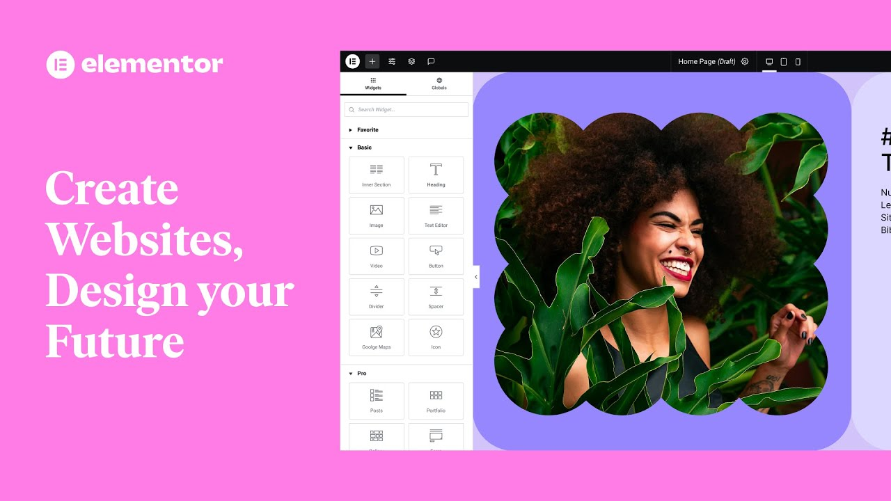
Elementor is a very powerful page builder that can help you create responsive designs with ease. Today, we'll explore how to create a responsive website design using Elementor.
![Image [1] - How to create responsive website design with Elementor?](https://www.361sale.com/wp-content/uploads/2025/05/20250514155230818-image.png)
1. Understandingresponsive design
Responsive design refers to the ability of a website to automatically adjust its layout to the screen size and resolution of different devices. Regardless of whether the user is using a cell phone, tablet or desktop computer, the content of the website is able to adapt to the screen size and maintain good readability and visual effects.
With Elementor's intuitive drag-and-drop interface, designers can optimize page elements for different devices.
2. Setting up a basic responsive layout
When you start creating pages with Elementor, the first thing to do is to set up a basic responsive layout. When editing a page, you can adjust the design elements directly in the left panel.
step one: Choose a page layout. When editing a page, choose a layout that suits your content and ensures that it is flexible.Elementor offers several layout options to meet different design needs.
![Images [2] - How to create responsive website design with Elementor?](https://www.361sale.com/wp-content/uploads/2025/05/20250515164159275-8ea158b225316b9e733114ff5c981af.jpg)
step TwoElementor has a built-in device preview feature that lets you switch to mobile, tablet, and desktop views while editing a page, so you can see how the page will look on different devices in real time.
![Image [3] - How to create responsive website design with Elementor?](https://www.361sale.com/wp-content/uploads/2025/05/20250514155454665-image.png)
step Three: Adjust the layout of columns and rows. On mobile devices, many elements may need to be arranged more compactly. You can adjust column widths, row heights, and spacing to make them look neater on smaller screens. By dragging and dropping to adjust these parameters, you can achieve the best presentation on different devices.
![Image [4] - How to create responsive website design with Elementor?](https://www.361sale.com/wp-content/uploads/2025/05/20250514155539761-image.png)
3. Setting up styles for different devices
Elementor provides separate style settings for different devices. When editing a page, you can set up separate settings for each devicecalligraphic styleSize, spacing, elements shown and hidden, etc.
step one: Font size. Fonts may appear differently on different devices. To ensure that it is not difficult to read on small screens, you can adjust the font size on your mobile device as needed. Simply select the appropriate device icon under the Style panel and adjust the font size.
![Image [5] - How to create responsive website design with Elementor?](https://www.361sale.com/wp-content/uploads/2025/05/20250514155614543-image.png)
step Two: Adjust spacing and padding. Bigger spacing and padding may be appropriate for larger screen devices, while on a phone or tablet, too much spacing may make the page look crowded. You can set different internal and external spacing for each device separately to ensure that the page content is clear and not cluttered.
![Image [6] - How to create responsive website design with Elementor?](https://www.361sale.com/wp-content/uploads/2025/05/20250514155649750-image.png)
step Three: Hide or show certain elements. Sometimes, certain elements may look out of place or take up too much space on a mobile device.Elementor Allows you to hide specific elements on different devices. This can be easily adjusted in the advanced settings for each element.
![Image [7] - How to create responsive website design with Elementor?](https://www.361sale.com/wp-content/uploads/2025/05/20250514155732856-image.png)
4. Use of "adaptive" elements and blocks
Elementor provides "adaptive" elements and blocks, which automatically adjust to the screen size. With these elements, you can ensure that the content of the page adapts itself to all devices. For example, images, buttons and text are automatically optimized for the size and proportions of the screen.
For example, the image size scales to the size of the device's screen. You can choose a different version of the image for each device, ensuring that both loading speed and image quality are optimized on each device.
5. Testing and optimization
Testing is an important step after creating a responsive design. You can use Elementor's device preview mode to see how it looks on different devices, and it's recommended to test it on an actual device. Browse your website in person using different devices such as phones, tablets, and computers to make sure the pages display smoothly on all screens.
In addition to testing, page load speed is an important aspect of optimization. Ensure that images are sized for mobile devices and use appropriate compression techniques to reduce page load times, thereby improving overall performance.
6. Continued optimization and updating
Your design needs to be checked and adjusted regularly, and you can ensure that your website always displays optimally on different devices.
Elementor s live editing feature makes these adjustments much easier. You can always modify the page content and layout to meet new needs without having to go through the entire page again.
![Image [8] - How to create responsive website design with Elementor?](https://www.361sale.com/wp-content/uploads/2025/05/20250514155845722-image.png)
concluding remarks
Creating responsive website designs with Elementor is a critical step in improving the quality of your website and user satisfaction. With Elementor's power and simplicity, it's easy to create web pages that work on different devices. With these tips, your website will be more visually and functionally appealing to visitors.

Link to this article:https://www.361sale.com/en/54314The article is copyrighted and must be reproduced with attribution.


![Emoji[wozuimei]-Photonflux.com | Professional WordPress repair service, worldwide, rapid response](https://www.361sale.com/wp-content/themes/zibll/img/smilies/wozuimei.gif)
![Emoticon[baoquan] - Photon Wave Network | Professional WordPress Repair Services, Worldwide Coverage, Rapid Response](https://www.361sale.com/wp-content/themes/zibll/img/smilies/baoquan.gif)

 简体中文
简体中文  English
  日本語
日本語  Français
  Español


No comments