


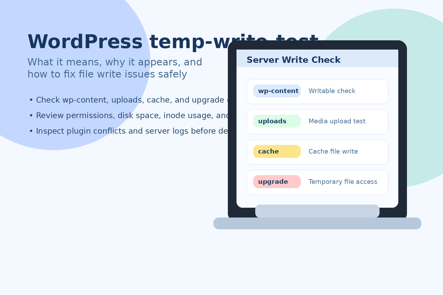
1. What is modular typesetting?
![Image[1]-Astra Modular Typography Guide: Creating Websites with Flexible Layouts](https://www.361sale.com/wp-content/uploads/2025/09/20250925113229368-image.png)
In WordPress themes, "modular layout" means that all parts of the page (such as header, footer, post area, sidebar, etc.) can be controlled and combined in separate modules. The advantage of this is:
- Users can enable or disable modules on demand.
- Each module can be individually styled and positioned.
- Different pages can use different layout schemes.
Astra ThemeAs the current popular lightweight WordPress theme, known for its flexible modular layout. It can meet the basic layout needs of personal blogs and also support the complex layout of e-commerce sites.
2. Header Layouts
2.1 Standard header
Astra DefaultfooterSimple and practical, left side Logo, right side navigation menu, suitable for content-based websites.
2.2 Transparent header
![Image [2]-Astra Modular Typography Guide: Creating Websites with Flexible Layouts](https://www.361sale.com/wp-content/uploads/2025/09/20250925114158851-image.png)
Transparent headers are often used on home pages or pages with large background images, where the logo and navigation are displayed directly above the image for a more modern visual effect.
2.3 sticky header
![Image [3]-Astra Modular Typography Guide: Creating Websites with Flexible Layouts](https://www.361sale.com/wp-content/uploads/2025/09/20250925113419841-image.png)
When the page scrolls, the sticky header is fixed at the top, making it easy for users to switch pages at any time.
2.4 Mobile Header
Astra allows separate headers for mobile, e.g. hide part of the menu and keep only the Logo and Burger buttons for a cleaner look on mobile.
2.5 Header module
Through Astra's Header Builder, you can add it in the header:
- search box
- Social Icons
![Image [4]-Astra Modular Typography Guide: Creating Websites with Flexible Layouts](https://www.361sale.com/wp-content/uploads/2025/09/20250925135619475-image.png)
- Shopping cart icon
- language switcher
- secondary menu
3. Footer Layouts
3.1 Basic Footer
![Image [5]-Astra Modular Typography Guide: Creating Websites with Flexible Layouts](https://www.361sale.com/wp-content/uploads/2025/09/20250925135824483-image.png)
default (setting)footersIncludes copyright information and a short menu.
3.2 Multi-column footer
![Image [6]-Astra Modular Typography Guide: Creating Websites with Flexible Layouts](https://www.361sale.com/wp-content/uploads/2025/09/20250925135954193-image.png)
Astra supports 1-5 column footers that can hold navigation, contact information, latest posts or social links.
3.3 Footer Widget Area
![Image [7]-Astra Modular Typography Guide: Creating Websites with Flexible Layouts](https://www.361sale.com/wp-content/uploads/2025/09/20250925140027632-image.png)
Users can add modules such as subscription forms, tag clouds, popular posts, etc. in the footer.
3.4 Advanced footer module (Astra Pro)
Upgrading Astra Pro gives you access to features such as double layer footers, background image footers, global color customization, and more.
4. Blog and article page layout
4.1 Blogroll Page
Astra offers a variety of presentation options:
- List Layout: The articles are arranged vertically in a single column, with each article displayed in a full row.
- Grid Layout: Display in two or three columns for a more compact and modern look. Articles are arranged in square or rectangular cards, either in two or three columns for a neat and unified look.
- Card Cover Layout: The articles are arranged in a grid format, with images and headlines as the visual focus of each piece of content, making it more modern overall and suitable for graphic-heavy blogs or product showcase websites.
![Image [8]-Astra Modular Typography Guide: Creating Websites with Flexible Layouts](https://www.361sale.com/wp-content/uploads/2025/09/20250925140752856-image.png)
4.2 Single article page
On article pages, Astra provides modular element controls that can be freely shown or hidden:
- caption
- Author Information
- Release time
- Classification & Labeling
- Number of comments
![Image [9]-Astra Modular Typography Guide: Creating Websites with Flexible Layouts](https://www.361sale.com/wp-content/uploads/2025/09/20250925141027170-image.png)
4.3 Reading experience optimization
Astra Support:
- Content width customization
![Image [10]-Astra Modular Typography Guide: Creating Websites with Flexible Layouts](https://www.361sale.com/wp-content/uploads/2025/09/20250925141255247-image.png)
- whether to displayFeatured Image
![Image [11]-Astra Modular Typography Guide: Creating Websites with Flexible Layouts](https://www.361sale.com/wp-content/uploads/2025/09/20250925141319888-image.png)
- Paragraph spacing and font settings
![Image [12]-Astra Modular Typography Guide: Creating Websites with Flexible Layouts](https://www.361sale.com/wp-content/uploads/2025/09/20250925141402338-image.png)
5. Page Layouts
5.1 Full-width layout
![Image [13]-Astra Modular Typography Guide: Creating Websites with Flexible Layouts](https://www.361sale.com/wp-content/uploads/2025/09/20250925141457242-image.png)
Suitable for display pages, such as Landing Pages or one-page websites.
5.2 Box Layout
![Image [14]-Astra Modular Typography Guide: Creating Websites with Flexible Layouts](https://www.361sale.com/wp-content/uploads/2025/09/20250925141542643-image.png)
There is white space on both sides of the page, which is more traditional and suitable for a corporate website.
5.3 Layout with sidebar
![Image [15]-Astra Modular Typography Guide: Creating Websites with Flexible Layouts](https://www.361sale.com/wp-content/uploads/2025/09/20250925141817594-image.png)
Supports left sidebar, right sidebar, or no sidebar at all. Different pages can be set individually.
5.4 Customizing Content Width
![Image [16]-Astra Modular Typography Guide: Creating Websites with Flexible Layouts](https://www.361sale.com/wp-content/uploads/2025/09/20250925142019626-image.png)
Astra can adjust the width of the article area with pixel or percentage precision.
6. WooCommerce Store Layout
The Astra and WooCommerce Integration Module is very useful if you are building an e-commerce website.
6.1 Product List Page
![Image [17]-Astra Modular Typography Guide: Creating Websites with Flexible Layouts](https://www.361sale.com/wp-content/uploads/2025/09/20250925143345451-image.png)
Astra defaults to Grid LayoutThe number of products displayed per line can be customized.
6.2 Product detail page
![Image [18]-Astra Modular Typography Guide: Creating Websites with Flexible Layouts](https://www.361sale.com/wp-content/uploads/2025/09/20250925142843181-image.png)
Provides single or double column layout, left and righta side-bar (in software)Switchable and supports product image magnifier function.
6.3 Shopping experience optimization
Astra Pro also offers:
- Quick View
![Image [19]-Astra Modular Typography Guide: Creating Websites with Flexible Layouts](https://www.361sale.com/wp-content/uploads/2025/09/20250925143219245-image.png)
- Distraction Free Checkout (DFC)
![Image [20]-Astra Modular Typography Guide: Creating Websites with Flexible Layouts](https://www.361sale.com/wp-content/uploads/2025/09/20250925143638963-image.png)
- Sticky Shopping Cart Button
![Image [21]-Astra Modular Typography Guide: Creating Websites with Flexible Layouts](https://www.361sale.com/wp-content/uploads/2025/09/20250925142948457-image.png)
7. Sidebar and widget layout
7.1 Global Sidebar Settings
![Image [22]-Astra Modular Typography Guide: Creating Websites with Flexible Layouts](https://www.361sale.com/wp-content/uploads/2025/09/20250925143944701-image.png)
Astra can set up unified sidebars for different types of content such as articles, pages, stores, and more.
7.2 Single-page customized sidebars
![Image [23]-Astra Modular Typography Guide: Creating Websites with Flexible Layouts](https://www.361sale.com/wp-content/uploads/2025/09/20250925144401517-image.png)
Individual pages can be set to have no sidebar or different sidebars.
7.3 Widget module
The sidebar can be placed in the sidebar:
- search box
![Image [24]-Astra Modular Typography Guide: Creating Websites with Flexible Layouts](https://www.361sale.com/wp-content/uploads/2025/09/20250925144612824-image.png)
- Latest Articles
- categorized directory
- Advertisement Banner
8. Modular enhancements (exclusive to Astra Pro)
Astra Pro Can unlock more features:
- Advanced Header: Double header, enhanced adhesive effect.
- Advanced Footer: Background image with multi-layer block design.
- Blog Enhancement: Waterfall layout.
![Image [25]-Astra Modular Typography Guide: Creating Websites with Flexible Layouts](https://www.361sale.com/wp-content/uploads/2025/09/20250925144910378-image.png)
- Site layout control: Fonts and spacing are more refined.
- Color Management: Uniform color settings across the board.
9. Summary
The modular layout of Astra templates covers the Header, Footer, Blog, Post Page, Content Area, WooCommerce Store, Sidebar and many other aspects. Users are able to flexibly combine these modules to create different styles from minimalist blogs to large e-commerce sites.
For beginners, the plug-ins and included modules are enough to get you up and running quickly, while advanced users can use Astra Pro to unlock more features and create a more personalized and professional looking website.
To make your website more beautiful and efficient, try Astra's Modular Typography now and make it a powerful tool to enhance your site's performance. Do it now and bring a new layout experience to your website!

Link to this article:https://www.361sale.com/en/77454/The article is copyrighted and must be reproduced with attribution.


![Emoji[wozuimei]-Photonflux.com | Professional WordPress repair service, worldwide, rapid response](https://www.361sale.com/wp-content/themes/zibll/img/smilies/wozuimei.gif)
![Emoticon[baoquan] - Photon Wave Network | Professional WordPress Repair Services, Worldwide Coverage, Rapid Response](https://www.361sale.com/wp-content/themes/zibll/img/smilies/baoquan.gif)

 简体中文
简体中文  English
  日本語
日本語  Français
  Español


No comments