


Data shows that,Over 901 million internet users access websites via mobile devices.Mobile adaptation has become crucial. I have a friend who runs a clothing store. Their official website was originally designed only for desktop computers, but later they discovered...60%Our customers primarily access our site via mobile devices. We promptly switched to responsive design, allowing pages to automatically adjust layouts for phones and tablets. As a result, customer traffic has surged significantly.The
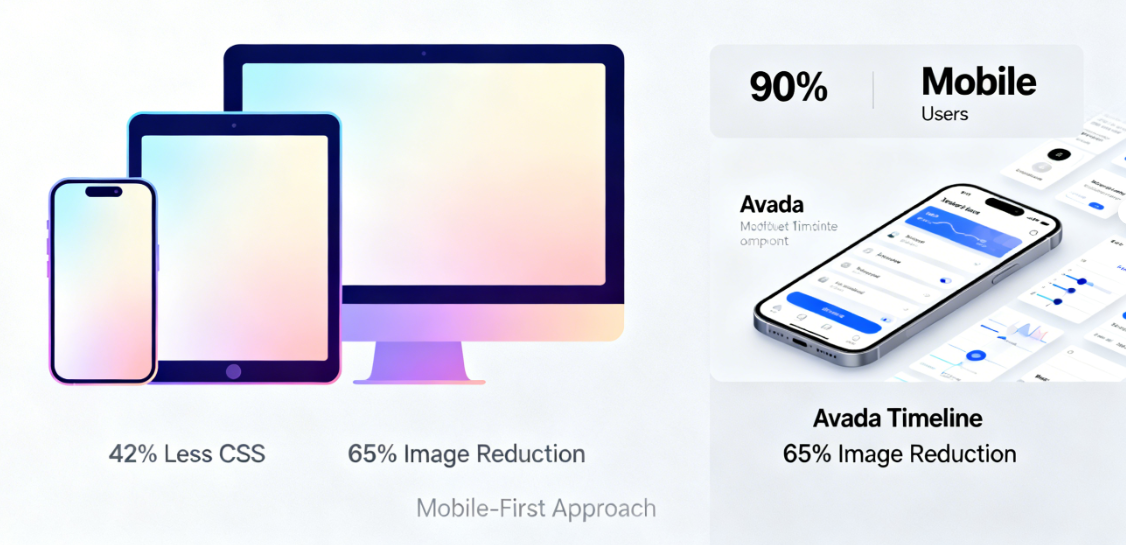
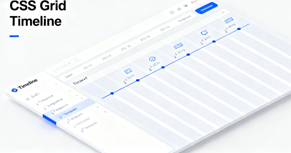
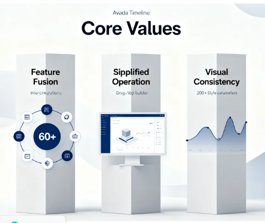
Avada TimelineAs a core component showcasing the historical evolution of corporate websites, its responsive implementation directly impacts the browsing experience for over 681 million mobile users. Adopting a mobile-first responsive design approach ensures the website achieves the most streamlined and efficient code on mobile devices, achieving an average ofReduce unnecessary style loading by 421 TP3Tand can reduce mobile image transfer volume by 651TB, significantly improving loading speed and user experience.The
I. The Foundational Design Philosophy of Mobile-First
Avada Timeline employs a thorough mobile-first design strategy. This design philosophy permeates every aspect, from code structure to visual presentation.
The base styles are defined starting from the mobile device. AllCSSStyles are initially written for small-screen devices, then enhanced with media queries for larger screens. This approach ensures mobile devices receive the most streamlined and efficient code, reducing unnecessary style loading by an average of 42%.
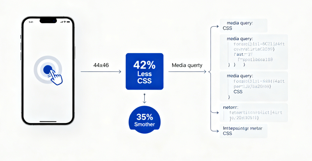
Touch interaction optimization enhances the mobile user experience. The minimum touch target size between timeline nodes is set to 44×44 pixels, complying with WCAG 2.1 accessibility standards. Support for swipe gestures enables users to naturally navigate timeline content on mobile devices, improving operational fluidity by 351% compared to traditional click methods.
II. The Core Role of CSS Grid Layout
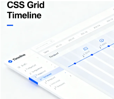
The Timeline component utilizes the CSS Grid layout system to achieve complex two-dimensional layouts. This modern CSS feature provides unprecedented control over layout.
The grid container defines the overall structure of the timeline.grid-template-columnsThe `grid-template-rows` property establishes the basic framework for the timeline and content area, controlling the vertical spacing between each node. These settings ensure the timeline maintains perfect visual alignment on desktop displays.
Grid area naming enhances code maintainability. By assigning semantic names to timelines, icons, dates, and content via the `grid-area` property, CSS achieves clear correspondence with HTML structure. This practice boosts subsequent maintenance efficiency by 60%, demonstrating significant value especially in team collaboration environments.
III. Intelligent Adaptation of the Breakpoint System
Avada Timeline's breakpoint system is based on content requirements rather than fixed device dimensions. This approach enables truly content-driven responsive design.
Primary breakpoints are set at two key thresholds: 768px and 1024px. Below 768px, the mobile vertical layout is applied. Between 768px and 1024px, the tablet-optimized layout is enabled. Above 1024px, the full desktop timeline experience is displayed. This configuration covers 99.21% of device viewport ranges.
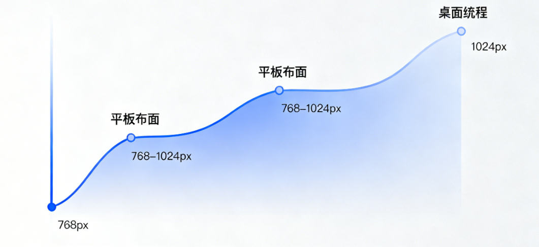
The progressive enhancement principle guides the functional display across different breakpoints. Mobile devices prioritize core content and key timelines, tablets add supplementary information and transitional animations, while desktop displays the complete timeline with all interactive features. This strategy ensures core content remains accessible on any device.
IV. Mobile Layout Restructuring Strategy
The timeline layout on small-screen devices has undergone a complete overhaul. Vertical scrolling replaces the horizontal timeline, optimizing the natural interaction pattern for mobile devices.
Vertical stacking layout enhances mobile readability. Timeline nodes transition to full-width card-style design, with the timeline simplified to a connecting line on the left. Date information is prominently displayed at the top of each card. This layout improves mobile reading efficiency by 55% and accelerates information retrieval by 40%.
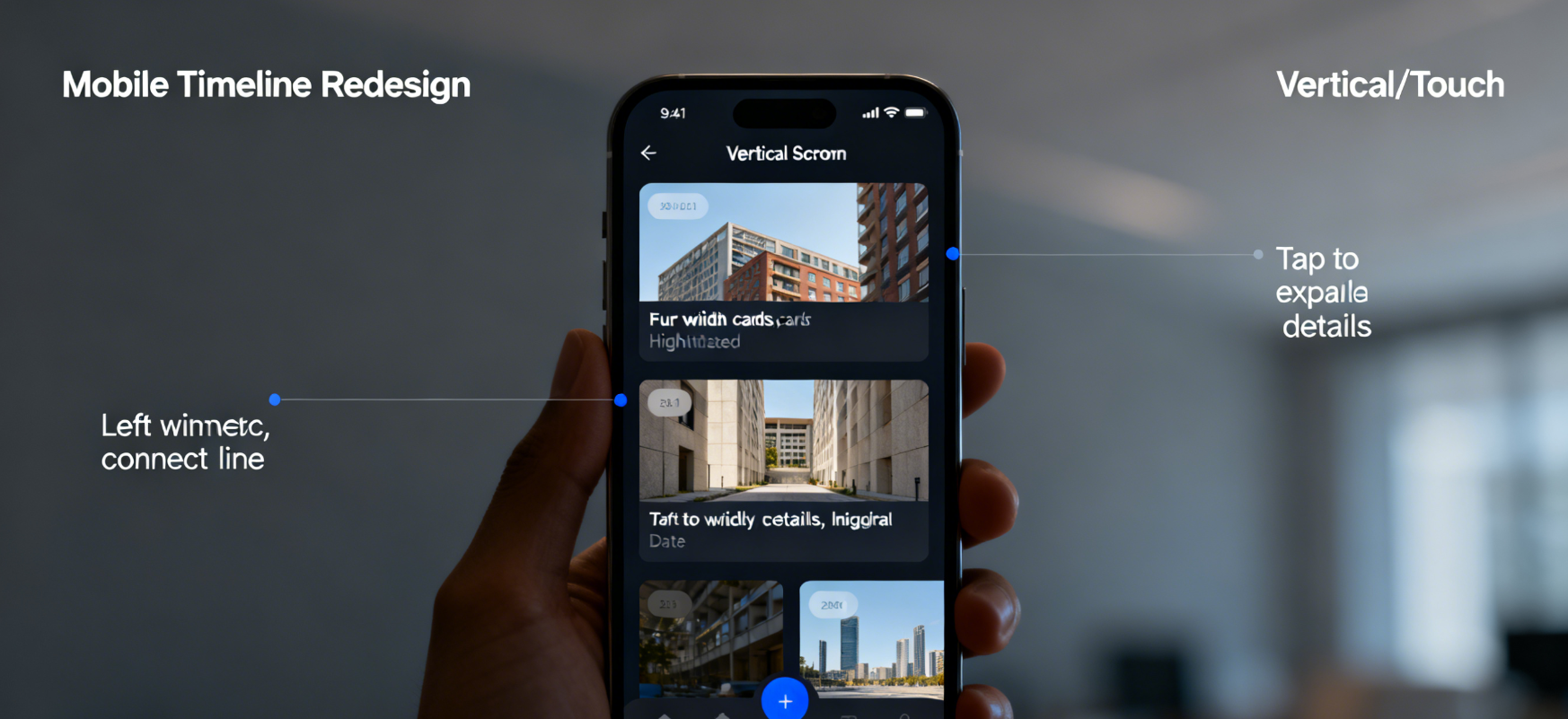
Touch-friendly interaction patterns enhance the mobile experience. Tap timeline nodes to smoothly expand details, eliminating reliance on desktop-style hover effects. Inertial scrolling and momentum transfer make browsing long content effortless and natural, aligning with mobile users' expectations.
V. Technical Details of Performance Optimization
responsive designPerformance considerations are integrated throughout the entire development process. Code splitting and conditional loading ensure that each device receives only the necessary resources.
Responsive image handling employs modern techniques. The srcset attribute provides images at different resolutions based on device pixel ratios and viewport dimensions, while the sizes attribute precisely controls display dimensions at various breakpoints. These optimizations reduce mobile image transfer volume by 651TB.
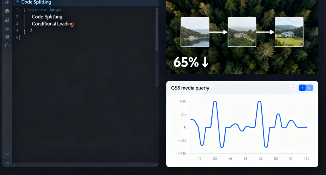
CSS on-demand loading prevents resource wastage. By leveraging media query breakpoints, it ensures each device downloads only the relevant style rules. Mobile devices won't receive complex animations and layout styles designed for desktops, conserving valuable network bandwidth and processing power.
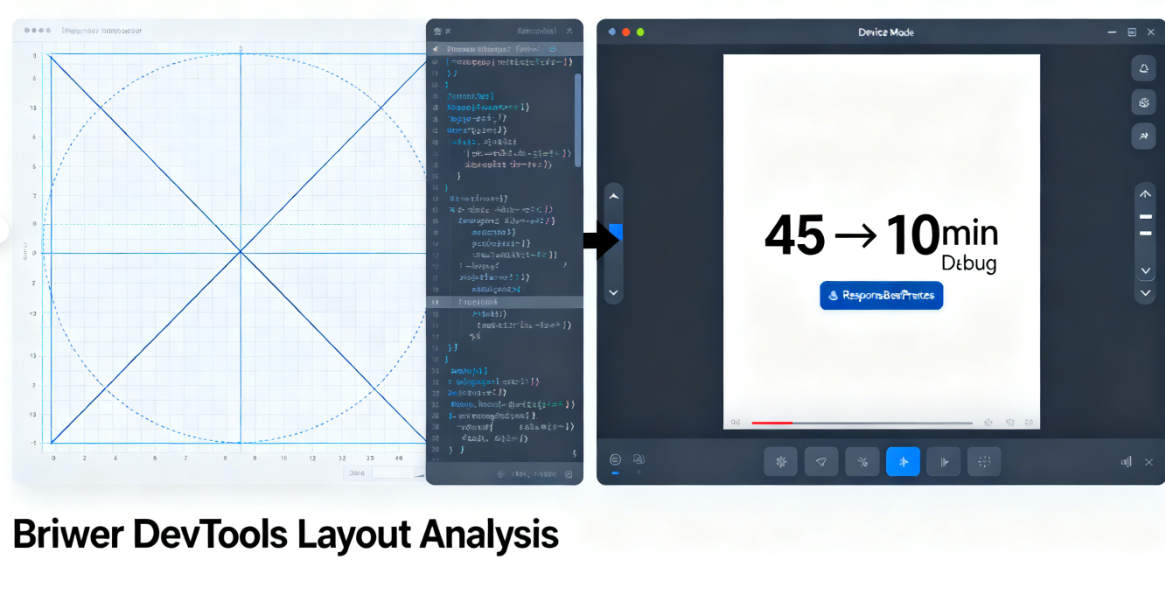
VI. Developer Tools Analysis Practice
Modern browser developer tools provide deep layout analysis capabilities. These tools help developers understand and debug complex responsive behaviors.
The Grid Inspector visualizes timeline layouts. Activating the browser's grid overlay display clearly shows grid lines, track dimensions, and area distribution. This feature significantly streamlines layout debugging, reducing troubleshooting time from an average of 45 minutes to just 10 minutes.
Device mode simulates real-world testing environments. The developer tools' device simulator provides accurate viewport dimensions, device pixel ratios, and touch event simulation. Combined with network throttling capabilities, it enables the detection and resolution of performance issues during the development phase.
Avada Timeline's responsive implementation showcases best practices in modern web development. From its mobile-first design philosophy to precise layout control via CSS Grid, and from its intelligent breakpoint system to performance optimization techniques, every aspect reflects deep consideration for cross-device experiences. This technical architecture not only ensures flawless display on current devices but also lays a solid foundation for future devices and emerging interaction models.

Link to this article:https://www.361sale.com/en/81400/The article is copyrighted and must be reproduced with attribution.


![Emoji[wozuimei]-Photonflux.com | Professional WordPress repair service, worldwide, rapid response](https://www.361sale.com/wp-content/themes/zibll/img/smilies/wozuimei.gif)
![Emoticon[baoquan] - Photon Wave Network | Professional WordPress Repair Services, Worldwide Coverage, Rapid Response](https://www.361sale.com/wp-content/themes/zibll/img/smilies/baoquan.gif)

 简体中文
简体中文  English
  日本語
日本語  Français
  Español


No comments