


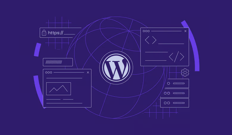
With today's website design, it's impossible to ignore "responsive"This important factor. With the popularity of mobile devices, the proportion of users visiting websites via cell phones and tablets is increasing day by day. If your website cannot be browsed smoothly on these devices, visitors may be lost, which directly affects the traffic and conversion rate of your website. Fortunately, WordPress website development has a program calledElementorThe page builder plugin, which is not only powerful, but also helps us to create responsive web pages easily. With the plug-in template plugin, Elementor provides ready-made solutions to make website building more efficient and flexible.
![Image [1] - How to quickly create responsive web pages with the Elementor plugin for external templates](https://www.361sale.com/wp-content/uploads/2026/01/20260109102134274-image.png)
The significance of responsive web design
What is Responsive Web Design?
Simply put, responsive web design is the ability for a web page to automatically adapt to the display of different devices. Whether it's on a cell phone, tablet or computer, the web page adjusts to the screen size of the device and ensures that the content adapts to the typography to provide the best browsing experience for the user. This design approach relies on flexible grid layouts and media queries to make web pages render perfectly on different sized devices.
![Image [2] - How to quickly create responsive web pages with the Elementor plugin for external templates](https://www.361sale.com/wp-content/uploads/2026/01/20260109102149801-image.png)
Why responsive design?
As more and more people surf the Internet on their cell phones or tablets, the presentation of a website directly affects the user experience. If a website doesn't display properly on mobile devices, users will definitely feel dissatisfied or even leave directly. And for businesses, lost users mean lost potential revenue. Therefore, responsive design not only enhances the user experience, but also helps to improve theSEO ranking. As you probably know.Google Internet companySearch engines such as these are more inclined to rank web pages that are adaptable to a variety of devices, and such sites are more likely to rank highly in search results.
Elementor Plugins Overview
What is Elementor?
Elementor is a powerful WordPress page builder plugin that allows users to design and customize web pages without writing any code and through drag and drop operations. It provides users with a wide range of design options, templates and widgets to make web page creation easy and flexible.
Advantages of the plug-in template plug-in
Elementor'sPlugin TemplateMake design work more efficient. With these templates, users can directly import already optimized responsive designs, saving a lot of design and development time. The best part is that these templates have been optimized for different devices, ensuring that the web pages will display perfectly on all types of devices.
How to create responsive web pages with Elementor?
Install and activate the Elementor plugin
Installing the Elementor plugin is very easy. Just go to the WordPress backend, search for and install the plugin, and once it's installed, click to activate it.Elementor is compatible with most WordPress themes, so you won't need to do much tweaking.
Choosing the right responsive template
In Elementor, you can choose from a library of templates in a variety of styles, many of which have been optimized for responsive design. When choosing a template, it's important to make sure that it's optimized for mobile devices, and Elementor usually clearly labels these templates as suitable for display on different devices.
![Image [3] - How to quickly create responsive web pages with the Elementor plugin for external templates](https://www.361sale.com/wp-content/uploads/2026/01/20260109102245714-image.png)
Customized template content
After selecting a template, you can start personalizing it. You can adjust the position, size, and style of text, images, buttons, and other elements according to your needs.Elementor's drag-and-drop operation is so intuitive that anyone can easily get started.
Optimize and check responsive effects
Although the templates provided by Elementor have been responsively designed, you still need to do some checking and optimization when actually editing. In the editing interface, Elementor provides a device preview function, so you can easily see how the page will be displayed on different devices. Adjust the display effect on each device according to the actual situation to make sure that the display is just right on cell phones, tablets and desktop devices.
![Image [4] - How to quickly create responsive web pages with the Elementor plugin for external templates](https://www.361sale.com/wp-content/uploads/2026/01/20260109102309429-image.png)
Practical tips for Elementor responsive design
Using the raster system
Elementor's built-in grid system is perfect for precise layout. By adjusting the width and spacing of columns, you can make sure that the content of your web pages doesn't get messed up on different devices. Whether it's a small mobile screen or a large desktop screen, the grid system will help you control the placement of individual elements to ensure a coordinated layout.
![Image [5] - How to quickly create responsive web pages with the Elementor plugin for external templates](https://www.361sale.com/wp-content/uploads/2026/01/20260109102323772-image.png)
Applied media queries
Elementor allows you to make specialized settings for different devices. You can switch between mobile, tablet and desktop modes and adjust the design to suit the needs of each device. For example, on mobile, certain elements may not be suitable for display, and you can choose to hide them; or adjust font sizes and button positions to ensure that the browsing experience for mobile users is not compromised.
![Image [6] - How to quickly create responsive web pages with the Elementor plugin for external templates](https://www.361sale.com/wp-content/uploads/2026/01/20260109102746420-image.png)
Enhance interactivity with dynamic content
Elementor'sdynamic contentFunctions can make the page more vivid and interactive. For example, you can insert dynamic modules such as blog posts, product listings, etc. to display relevant content with real-time updates. This not only enhances the interactivity of your website, but also improves the user's dwell time, which in turn helps boost SEO rankings.
concluding remarks
pass (a bill or inspection etc)Elementor external template plugin, creating responsive web pages has become less complicated, and designers and developers are able to easily build modern web pages that adapt to a variety of devices. Whether you are a novice or an experienced developer, Elementor allows you to build web pages in no time. By choosing the right templates and optimizing the display on each device, you can provide visitors with a smooth browsing experience and improve your site's search engine ranking.

Link to this article:https://www.361sale.com/en/85646The article is copyrighted and must be reproduced with attribution.


![Emoji[wozuimei]-Photonflux.com | Professional WordPress repair service, worldwide, rapid response](https://www.361sale.com/wp-content/themes/zibll/img/smilies/wozuimei.gif)
![Emoticon[baoquan] - Photon Wave Network | Professional WordPress Repair Services, Worldwide Coverage, Rapid Response](https://www.361sale.com/wp-content/themes/zibll/img/smilies/baoquan.gif)

 简体中文
简体中文  English
  日本語
日本語  Français
  Español


No comments