


When building a website, how do you ensure that fonts display consistently across all devices and browsers? In the WordPress On websites, fonts may be displayed differently depending on the device (e.g., desktop, mobile, tablet) and operating system (e.g., Windows, Mac, Android) that the user is using. This not only affects the appearance, but also the user experience. In this article, we will introduce how to solve this problem and ensure that your WordPress Page Maintain the same font across devices.

Why are the fonts displayed inconsistently in different devices?
The problem of inconsistent font display is usually caused by several factors:
1. Operating System Font Rendering Differences
- Windows (computer) respond in singing Mac The systems use different font rendering engines, resulting in the same font potentially displaying different thickness, spacing, and form in the two operating systems.
2. Browser Differences

- Chrome, Firefox, Safari and other browsers will use different font rendering methods. For example, theChrome will tend to use operating system fonts, while the Safari respond in singing Firefox Possibly with higher quality anti-aliasing technology.
3. Lack of a proper Font Stack (Font Stack)
- If the font stack is not set appropriately, the browser will fall back based on the fonts available on the system, resulting in inconsistent fonts across devices.
4. Web Fonts Load Delay
- utilization web (loanword) calligraphic style(e.g. Google Fonts), sometimes font file loading is delayed or fails, causing the page to be temporarily displayed as the browser's default font, thus affecting consistency.
5. Screen resolutions and display settings for different devices
- On different devices (especially mobile device (smartphone, tablet, etc)), differences in screen resolution and display settings may cause fonts to look thicker or thinner than they do on desktop devices.
How do I fix font inconsistencies?
Here are some best practices and solutions to help you in the WordPress Achieving Consistency Across Websitescalligraphic styleShow.
1. Using Web Fonts (such as Google Fonts or Adobe Fonts)
Web Fonts is a cross-platform font format that ensures fonts are displayed consistently across devices and browsers.
- Google Fonts: a free web font library that provides a large number of fonts that can be used with a simple CSS References achieve font consistency. procedure::
- go into Google Fonts website, choose the font you need.
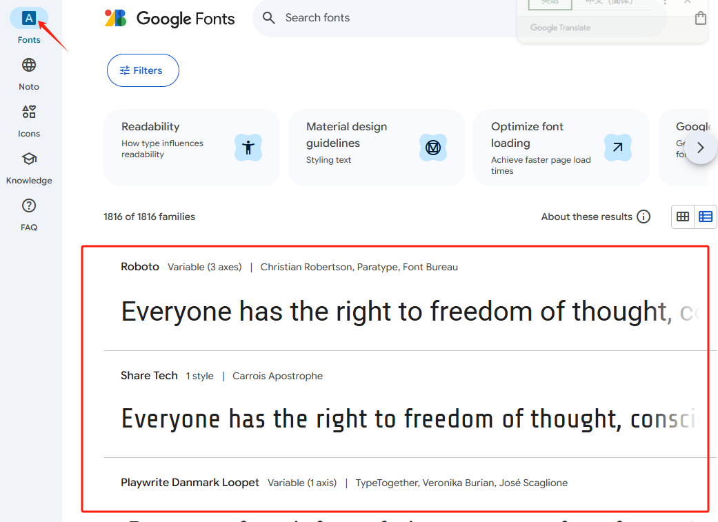
- Click "embedding" button, copy the generated CSS LinksThe
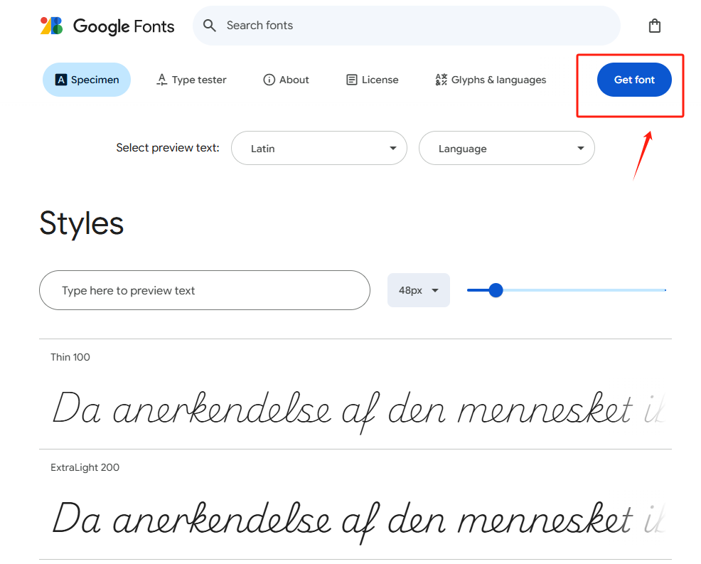

- Paste this link into the WordPress theme's
header.phpOr through theme settings (e.g. Elementor maybe Custom CSS) to add. - Adobe Fonts: If you need more specialized fonts, you can use the Adobe Fonts(formerly known as Typekit), which also offers embedding similar to Google Fonts.
![图片[6]-如何解决 WordPress 页面中不同设备显示字体不一致的问题?](https://www.361sale.com/wp-content/uploads/2025/05/20250513183904310-image.png)
Using web fonts not only ensures that fonts are consistent across devices, but also improves page loading speed and display.
2. Setting the Font Stack
To ensure font consistency, font stacks are used as a fallback option when the browser fails to load the font you specify. In WordPress, the risk of font inconsistency can be minimized by using a proper font stack. Here are three ways to do this:
- Theme Customization: Login to the backend and go to "Appearance" - "Customize", find the Font Settings area, select the preset font stack or manually enter it in the format, and save the preview effect.
- Editing Style Sheets: found in "Appearance" - "Edit"
style.cssfocusing onbody,h1and other selectors to addfont-familyattribute, such asbody {font-family: "Open Sans", Arial, sans-serif;}Remember to back up before modifying. - Using plug-ins: Search for "Easy Google Fonts" in "Plugins" - "Install Plugins" and follow the wizard to set font stacks for different page elements after installation.
Recommended Font Stack Example::
font-family: 'Roboto', 'Arial', sans-serif;
- In this example, the
Robotois your preferred web font. If your browser can't load it, theArialwill be used as an alternative font, if evenArialalso fails to load, the system default sans-serif font is used.
Ensure that your font stack contains commonly used font options and is able to behave consistently across multiple environments.
3. utilization CSS Adjusting font rendering
CSS provides properties to adjust the display of fonts to help optimize their performance on different devices.
- font-smoothing: This property can be used to improve the display of fonts in different operating systems, especially for the Mac OS X respond in singing iOSThe
body {
    -webkit-font-smoothing: antialiased; /* For Safari and Chrome */
    -moz-osx-font-smoothing: grayscale; /* For Firefox on macOS */
}
such CSS property ensures smoother font rendering and improves the visual appearance of the page.
4. Optimize responsive design and font size
Differences in screen size and resolution across devices can affect the readability and consistency of fonts. By responsive design(Responsive Design), you can ensure that fonts are displayed at the right size on different devices.
In the CSS style file, use the Media Enquiry(Media Queries) to adjust the font size, you can use different font sizes for different screen widths:
body {
    font-size: 16px; /* Default font size for desktop */
}

@media (max-width: 768px) {
    body { font-size: 14px; /* Font size for tabletop */ }
        font-size: 14px; /* Font size for tablets and mobile devices */ }
    }
}
In this way, it is ensured that the fonts are more readable on cell phones and tablet devices.
5. Cache font files and enable CDN

Sometimes, slow loading or interruptions of web fonts can lead to inconsistent fonts. Use the Content Delivery Network (CDN) to host font files, which can speed up font loading and reduce the probability of loading failures.
- If you use the Google FontsThey've been passed through Google's CDN hosting, no additional configuration is required.
- If you self-host your font files, you can use the Cloudflare or other CDN services to speed up font loading.
6. Ensure font file compatibility
Different operating systems and browsers support different font formats. When using custom fonts, make sure to provide font files in multiple formats (e.g. WOFF,WOFF2,TTF,EOT) to ensure compatibility.
@font-face {
    font-family: 'CustomFont'.
    src: url('custom-font.woff2') format('woff2'),
         url('custom-font.woff') format('woff'),
         url('custom-font.ttf') format('truetype'); font-weight: normal; font-weight: 0.0
    font-weight: normal;
    font-style: normal; }
}
7. Testing cross-device and cross-browser
Before publishing, use the Cross-browser testing tools(e.g. BrowserStack maybe CrossBrowserTesting) Check how fonts are displayed on different operating systems, browsers and devices. This ensures that the fonts are displayed consistently and that problems are identified and fixed in a timely manner.
summarize
tackle WordPress The key to inconsistent page fonts lies in choosing the right web fonts, setting up a proper font stack, optimizing CSS rendering and responsive design, and ensuring font compatibility. These optimizations help keep fonts consistent across devices and browsers, enhancing the professional image and user experience of your website.

Link to this article:https://www.361sale.com/en/53705/The article is copyrighted and must be reproduced with attribution.


![表情[wozuimei]-光子波动网 | WordPress教程、Elementor教程与故障修复](https://www.361sale.com/wp-content/themes/zibll/img/smilies/wozuimei.gif)
![表情[baoquan]-光子波动网 | WordPress教程、Elementor教程与故障修复](https://www.361sale.com/wp-content/themes/zibll/img/smilies/baoquan.gif)

 简体中文
简体中文  English


No comments