


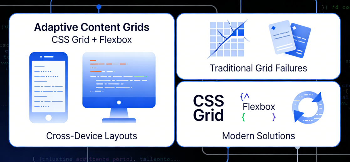
Traditional grid systems often suffer from content misalignment, overlapping cards, or imbalanced visual whitespace at different breakpoints. These issues not only compromise visual consistency but also directly impact content accessibility and performance. This article will delve into the design principles of responsive grid layouts based on CSS Grid and Flexbox, integrating modern image loading techniques to build a truly adaptive cross-device content presentation solution.
Chapter 1: The Evolution and Core Challenges of Circular Grid Layouts
Responsive design has evolved from fixed grids to fluid layouts, and now to today's precise control based on container queries. However, achieving true adaptability in multi-column content grid scenarios still faces several structural challenges.
1.1 Limitations of Traditional Responsive Grids
Early responsive grids were predominantly built using floating or inline block elements, which exhibited significant shortcomings in controlling column item alignment, vertical spacing, and equal-height layouts. Even when employing Flexbox, visual discontinuities persist in scenarios involving multiple rows and columns with items of varying heights.

The key pain points manifest across three dimensions:
- Column misalignmentItems of different heights produce jagged edges when wrapping to new lines.
- Breakpoint JumpLayout undergoes abrupt changes at specific screen widths rather than smooth transitions.
- Blank ManagementBlank spaces generated at the end of lines cannot be intelligently allocated, disrupting visual rhythm.
1.2 Paradigm Shift in CSS Grid
CSS Grid LayoutThe introduction of Flexbox has revolutionized how grid systems are built. Its two-dimensional layout capabilities enable developers to control both rows and columns simultaneously, creating truly flexible grid containers.
The core advantages of Grid include:

- Explicit Mesh Definition: By
grid-template-columnsrespond in singinggrid-template-rowsPrecise Control of Grid Trajectories - Implicit Mesh AdaptationUnspecified tracks are automatically generated and assigned by the browser.
- Gap Control Independent::
gapThe property separates the logical relationship between item spacing and margins. - Powerful Placement AlgorithmProjects may span multiple tracks as needed while maintaining the integrity of the grid structure.
1.3 Design Philosophy of Cyclic Grids
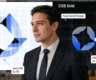
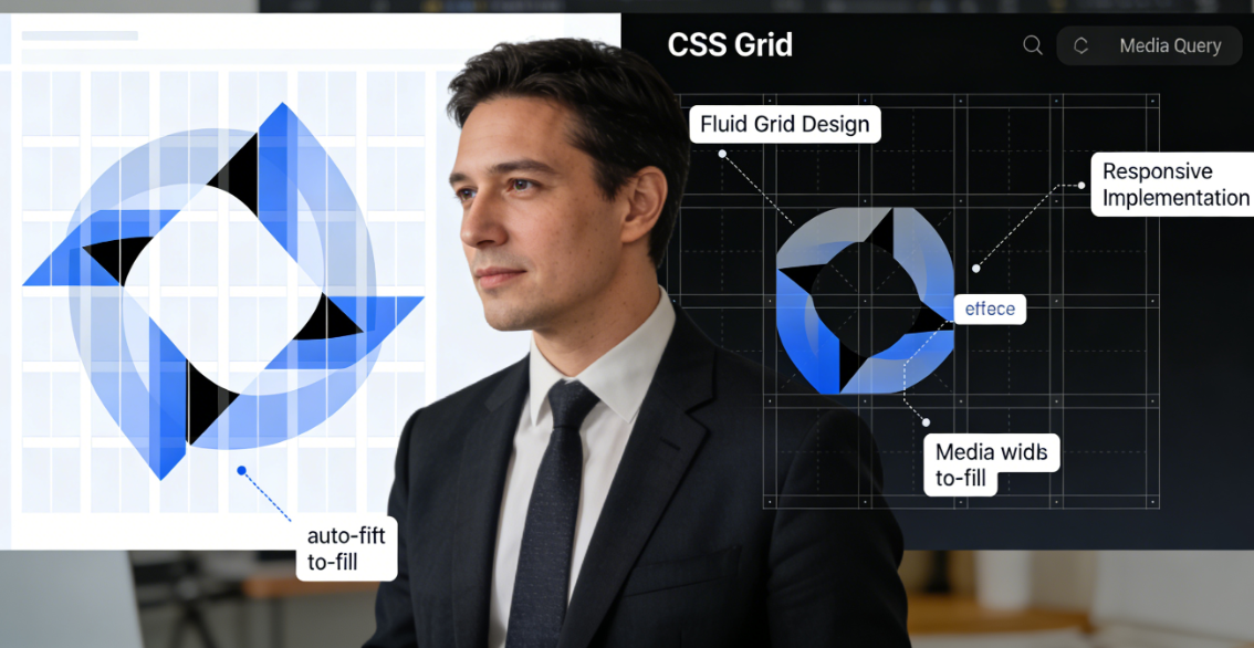
The fluid grid is a content-first responsive pattern. Its core principle is that the number of grid columns should not be determined by fixed breakpoints, but rather dynamically calculated based on the available container width and the minimum ideal width of the items. This pattern utilizes CSS's repeat() Comparison of functions with auto-fit/auto-fill Keyword implementation creates a truly fluid, space-based grid system.
Chapter 2: Technical Implementation of Building Responsive Circular Grids
Implementing a robust circular grid requires understanding CSS Grid's specific functions and units, combined with media queries for precise control.
2.1 Basic Loop Mesh Pattern
The most basic looping grid is achieved with a single line of concise CSS code:
.grid-container { display: grid; grid-template-columns: repeat(auto-fit, minmax(280px, 1fr)); gap: 1.5rem; }Code Parsing:
repeat(auto-fit, ...)Instruct the browser to fit as many columns as possible within the container.minmax(280px, 1fr)Set the minimum width of each column to 280px and the maximum width to 1 score unit.- When the container width changes, the number of columns automatically adjusts to maintain a minimum width of 280px per column.
2.2 Multi-Breakpoint Fine-Grained Control
A single minimum width value cannot meet the needs of all devices. Enhance grid behavior through layered media queries:
.grid-container {   display: grid;   gap: 1rem;   grid-template-columns: 1fr;   /* Mobile default single column */ } @media (min-width: 480px) {   .grid-container {     grid-template-columns: repeat(auto-fit, minmax(240px, 1fr));   } }
    grid-template-columns: repeat(auto-fit, minmax(240px, 1fr)); } } @media (min-width: 768px) { .grid-container { grid-template-columns: repeat(auto-fit, minmax(200px, 1fr));
    gap: 1.5rem; } } @media (min-width: 1200px) { .grid-container { grid-template-columns: repeat(auto-fit, minmax(180px, 1fr)); gap: 2rem; } }
Strategy Analysis:
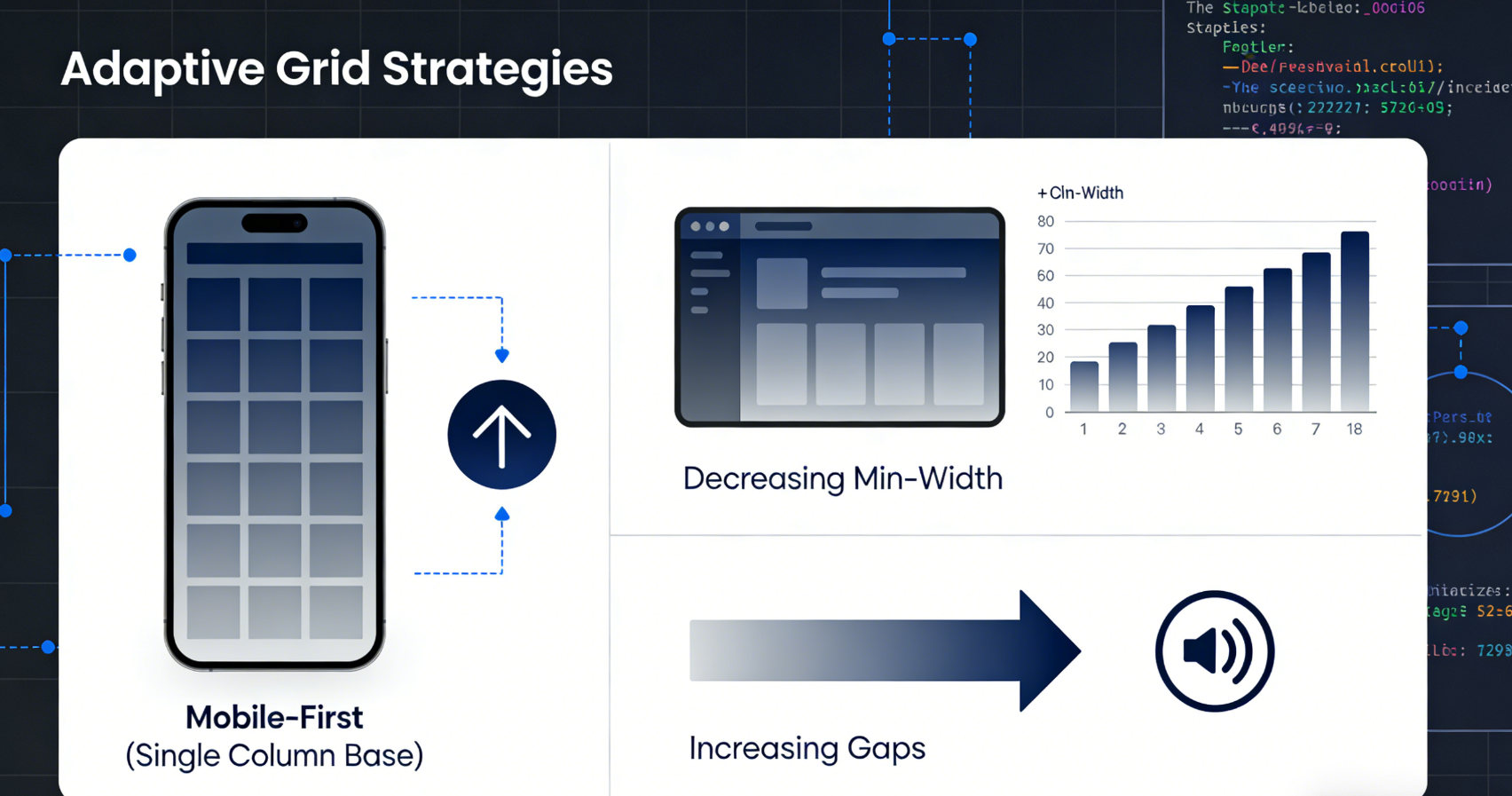
- Mobile-first: Start with a single column and progressively enhance
- Decreasing minimum width: The larger the screen, the smaller the minimum column width, allowing for more columns.
- Incremental Gaps: Larger screens require more visual breathing room.
2.3 Handling Grid Items with Unequal Heights
Uneven-height items are a common challenge in grid layouts. CSS Grid offers several solutions:
/* Solution 1: Row-based implicit grid */ .grid-container { grid-auto-rows: minmax(100px, auto);
  grid-template-columns: repeat(auto-fit, minmax(250px, 1fr)); } /* Solution 2: Explicit row height pattern */ .grid-container { grid-template-rows: masonry; /* Experimental feature, note browser support */ }

/* Solution 3: Item-level height control */ .grid-item {   height: 100%;   /* Coordinate with parent constraints */   min-height: 200px;   /* Set minimum height baseline */ }
2.4 Advanced Loop Mode: Hybrid Dynamic Column Count and Fixed Column Width
Complex scenarios may require hybrid strategies:
.grid-container { display: grid; grid-template-columns: repeat(auto-fit, minmax(min(1001px, 300px), 1fr)); }This model utilizes min() The function ensures column widths do not exceed 300px, but can shrink to 100% of the container width on smaller screens, enabling smoother responsive behavior.
Chapter 3: Adaptation Strategies for Mobile and Desktop Platforms
Different device categories have distinct requirements and constraints for grid layouts. Understanding these differences is key to creating excellent responsive designs.
3.1 Mobile Grid Design Principles
The narrow width and touch-based interaction of mobile devices require special consideration:
Vertical Rhythm Optimization:
.mobile-grid {   grid-template-columns: 1fr;
  row-gap: 1rem; column-gap: 0; } /* Maintain comfortable touch target dimensions within items */ .mobile-grid-item { min-height: 44px; /* Minimum touch size recommended by Apple's Human Interface Guidelines */ padding: 1rem; }
Directional Adaptability:
/* Utilize extra width in landscape mode */ @media (orientation: landscape) and (max-width: 768px) { .mobile-grid { grid-template-columns: repeat(2, 1fr); column-gap: 0.75rem; } }3.2 Desktop Grid Density Management
Desktop displays offer more space, but also require preventing excessive information density:
Density Gradient Control:
.desktop-grid {   /* Base desktop grid */   grid-template-columns: repeat(auto-fit, minmax(280px, 1fr)); } /* Density optimization for ultra-wide screens */ @media (min-width: 1600px) {   .desktop-grid {     grid-template-columns: repeat(auto-fit, minmax(280px, 1fr));     max-width: 1440px;     /* Limit maximum width */   }   .desktop-grid {     grid-template-columns: repeat(auto-fit, minmax(280px, 1fr));     max-width: 1440px;     /* Density optimization */   }   .desktop-grid {     grid-template-columns: repeat(auto-fit, minmax(280px, 1fr));     max-width: 1440px;     /* Limit maximum
  .desktop-grid {   grid-template-columns: repeat(auto-fit, minmax(250px, 1fr));   max-width: 1440px;   /* Limit maximum width to prevent excessively long reading lines */   margin: 0 auto; } }
Split Screen and Focus Area:
.featured-grid { display: grid; grid-template-columns: 2fr 1fr; /* Wider main content area */ grid-template-areas: "main sidebar"; gap: 2rem; }3.3 Cross-Device Consistent Visual Hierarchy
Ensure the grid conveys the same visual importance across different devices:
.grid-item {   /* Base style consistency */   border-radius: 8px;   box-shadow: 0 2px 8px rgba(0,0,0,0.1);   transition: transform 0.2s ease; }

/* Hover effect applies only to non-touch devices */ @media (hover: hover) {   .grid-item:hover {     transform: translateY(-4px);     box-shadow: 0 8px 24px rgba(0,0,0,0.15);   } }
Chapter 4: Performance Optimization and Image Adaptive Loading
Grid layouts often contain a large number of visual resources, especially images. Optimizing the loading of these resources is critical for performance.
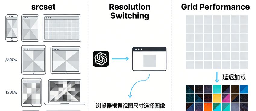
4.1 Implementing Resolution Switching with srcset
srcsetThe attribute enables the browser to select the most suitable image based on the device's pixel ratio and viewport dimensions:
<img
  src="image-800w.jpg"
  srcset="image-400w.jpg 400w,          image-800w.jpg 800w,          image-1200w.jpg 1200w,          image-1600w.jpg 1600w"
  sizes="(max-width: 480px) 100vw,         (max-width: 768px) 50vw,         (max-width: 1200px) 33vw,         25vw"
  alt="Descriptive text"
  loading="lazy"
>
sizes attribute and grid integration:
<em>/* CSS Grid Column Definition */</em>
.grid-container {   grid-template-columns: repeat(auto-fit, minmax(300px, 1fr)); }

<em>/* Corresponding sizes attribute */</em>
<img sizes="(max-width: 639px) 100vw,             (max-width: 1023px) 50vw,             (min-width: 1024px) calc((100vw - 3rem) / 3)"
     ...>
4.2 Lazy Loading Using Intersection Observer
Implement custom lazy loading for greater control:
class GridLazyLoader {   constructor(selector = '.lazy-grid-item') {     this.items = document.querySelectorAll(selector);     this.initObserver();   }

  initObserver() { this.observer = new IntersectionObserver((entries) => { entries.forEach(entry => { if (entry.isIntersecting) { this.loadItem(entry.target); this.observer.unobserve(entry.target);
        } }); }, { rootMargin: '50px 0px', /* Start loading 50px in advance */ threshold: 0.01 }); this.items.forEach(item => this.observer.observe(item)); }

  loadItem(element) { const img = element.querySelector('img[data-src]'); if (img) { img.src = img.dataset.src; img.removeAttribute('data-src'); } } }
4.3 Container Query and Image Optimization
CSS container queries enable styling based on a component's own dimensions rather than the viewport:
.grid-item { container-type: inline-size; } @container (min-width: 300px) { .grid-item img { border-radius: 12px; } }

@container (min-width: 500px) { .grid-item { display: grid; grid-template-columns: 1fr 1fr; align-items: center; } }
4.4 CLS Optimization and Dimension Retention
Cumulative Layout OffsetThis is a common issue with grid layouts. Preventing Content-Length Shift (CLS) by preserving image placeholder space:
.grid-item-image-container { position: relative; aspect-ratio: 16 / 9; /* Explicit aspect ratio */ background-color: ##f5f5f5; overflow: hidden; }

.grid-item-image-container img {   position: absolute;   top: 0;   left: 0;   width: 100%;   height: 100%;   object-fit: cover;   /* Maintain aspect ratio to fill container */ }
Chapter 5: Debugging and Testing Strategies
assurerecurrent gridA systematic testing approach is required to ensure proper operation across all target devices.
5.1 Development Tools and Visual Debugging
Modern browser developer tools offer powerful grid debugging capabilities:
/* Debug class during development */ .debug-grid { background-image: repeating-linear-gradient(90deg, transparent, transparent 19px, rgba(255,0,0,0.1) 20px),
    repeating-linear-gradient(0deg, transparent, transparent 19px, rgba(0,255,0,0.1) 20px); } /* Or use the overlay grid in developer tools */ /* Chrome DevTools → Layout → Grid overlays */
5.2 Multi-Device Test Matrix
Establish a systematic testing checklist:
| test dimension | mobile device (smartphone, tablet, etc) | flatbed | desktop | Large-screen desktop |
|---|---|---|---|---|
| minimum width | 320px | 768px | 1024px | 1440px+ |
| maximum width | 414px | 1024px | 1439px | 2560px+ |
| Expected number of columns | 1 | 2 | 3-4 | 4-6 |
| Touch Target | ≥44px | ≥44px | inapplicable | inapplicable |
| Loading Performance | High Priority | Medium Priority | (an official) standard | (an official) standard |
5.3 Automated Visual Regression Testing
Integrate visual testing into the development process:
// Capture grid layout using Puppeteer const puppeteer = require('puppeteer'); async function captureGridLayout(url, viewports) {   const browser = await puppeteer.launch();   const page = await browser.newPage();

  for (const viewport of viewports) { await page.setViewport(viewport); await page.goto(url); // Capture grid area
    await page.screenshot({ path: `grid-${viewport.width}x${viewport.height}.png`, fullPage: false, clip: { x: 0, y: 0, width: viewport.width, height: 800 } }); }

  await browser.close(); }
5.4 Performance Metrics Monitoring
Tracking grid layout for the coreWeb MetricsImpact:
// Monitor layout shifts new PerformanceObserver((list) => {   for (const entry of list.getEntries()) {     if (entry.hadRecentInput) return;     console.log('CLS contribution:', entry.value);
    console.log('Affected element:', entry.sources); } }).observe({type: 'layout-shift', buffered: true}); // Monitor if LCP element is a grid item new PerformanceObserver((list) => { const lcpEntry = list.getEntries().at(-1);

  if (lcpEntry.element.classList.contains('grid-item')) { console.log('LCP is within a grid item'); // Optimize loading priority for this image } }).observe({type: 'largest-contentful-paint', buffered: true});
concluding remarks
Responsive looping grids represent modernCSS LayoutThe pinnacle of capability. By leveraging CSS Grid's adaptive capabilities,FlexboxBy combining precise breakpoints with media queries and alignment controls, developers can create truly adaptive layout systems. These systems not only handle various screen sizes gracefully but also integrate seamlessly with performance optimization techniques, ensuring fast loading speeds and a smooth visual experience.
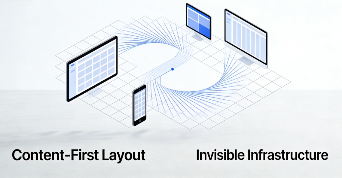
A successful implementation of a fluid grid system requires balancing multiple factors: the visual hierarchy of content, the physical constraints of devices, performance budgets, and accessibility requirements. As new features like CSS container queries and subgrids become more widely adopted, we will be able to create more refined and adaptive layout systems. These systems will no longer merely respond to viewport dimensions but will perceive the container's own size and context, providing the most suitable presentation for each content block.
Ultimately, the goal of responsive fluid grids is to create an invisible, adaptive infrastructure that presents content in the most appropriate way on any device, while maintaining consistent brand expression and user experience quality. When grid layouts are implemented correctly, users won't notice their existence—they'll only experience content flowing naturally and presenting seamlessly. This is the pinnacle of excellent responsive design: technology serves content, and layout becomes invisible.

Link to this article:https://www.361sale.com/en/82436The article is copyrighted and must be reproduced with attribution.


![Emoji[wozuimei]-Photonflux.com | Professional WordPress repair service, worldwide, rapid response](https://www.361sale.com/wp-content/themes/zibll/img/smilies/wozuimei.gif)
![Emoticon[baoquan] - Photon Wave Network | Professional WordPress Repair Services, Worldwide Coverage, Rapid Response](https://www.361sale.com/wp-content/themes/zibll/img/smilies/baoquan.gif)

 简体中文
简体中文  English
  日本語
日本語  Français
  Español


No comments