


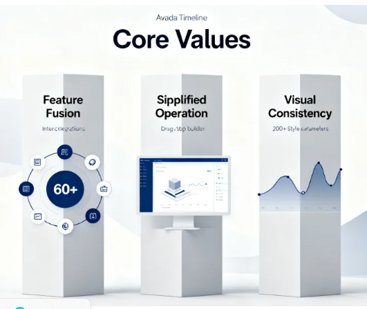
In the digital age, one of the core manifestations of brand professionalism lies in the high degree of visual consistency and coherence across its online touchpoints. As a brand's core digital asset, a website's visual consistency between pages and components directly impacts visitors' cognitive trust and brand image. However, in building multi-page, multi-content-type websites, manually maintaining consistency in fundamental design elements like colors, fonts, and spacing is a laborious and error-prone task.
Data reveals that visual inconsistencies occur in over 80% of small and medium-sized websites lacking systematic management. Designers and content managers spend nearly 30% of their maintenance time correcting styles. Traditional approaches rely on memory, documentation, or fragmentedCSS OverrideNot only is it inefficient, but it also sows the seeds of chaos in team collaboration and long-term iteration.Nexter Blocks The built-in global style feature is specifically designed to address this fundamental collaboration and efficiency challenge. It transforms abstract design specifications into a centrally managed, real-time system engineering solution, establishing a solid digital design foundation for brands.
I. Core of Global Styles: Building a Unified Design Variable Library
Nexter Blocks' global styling feature is essentially a centralized design variable management system. These variables permeate every corner of the editor, providing a unified design source for all blocks and replacing the traditional, decentralized, hard-coded approach to style definition.
1.1 Definition and Application of the Global Color System
Color is the most potent visual element in brand identity. Global color settings enable administrators to define a complete brand color palette.
- Primary Color, Secondary Color, and Semantic Color DefinitionsIn the Global Styles panel, you can preset the primary brand color, multiple secondary colors, and function-specific colors (such as success, warning, and error colors). These colors are assigned clear descriptive names (e.g., "Primary Brand Blue," "Success Green") rather than hexadecimal codes.
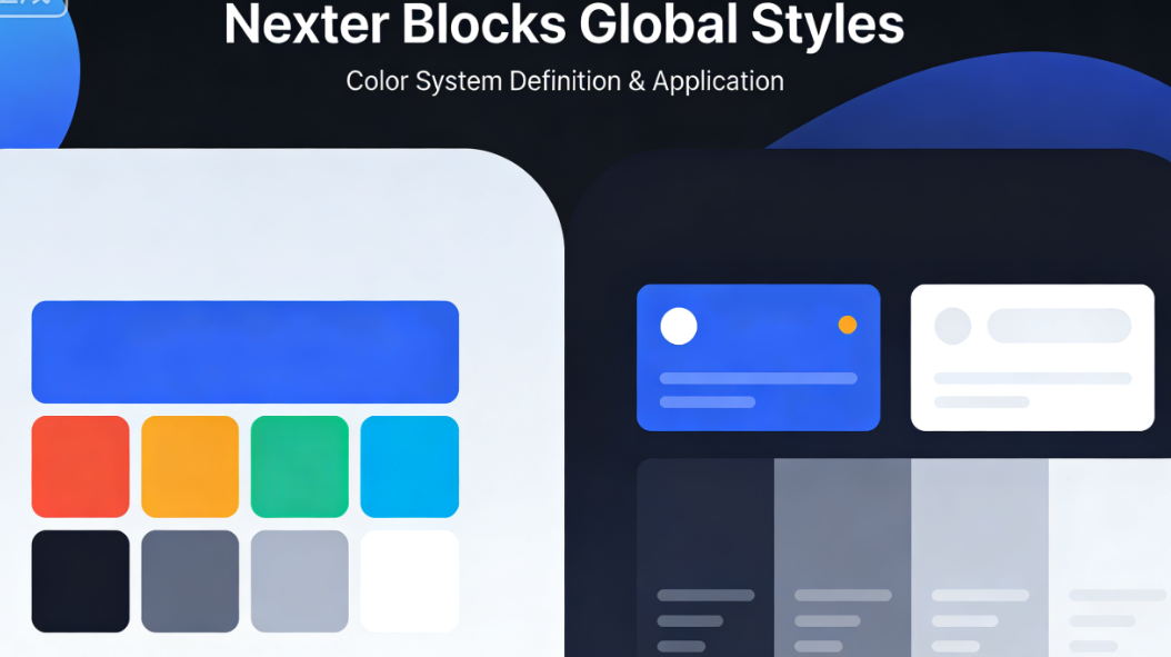
- One-Click Application and Global UpdatesWhen designing, select colors for any block that supports color settings (buttons, headings, backgrounds) directly from the global palette using their corresponding semantic names. Should brand colors require adjustment in the future, simply modify the corresponding color value once in the global styles panel. All elements across the site that use this color variable will automatically update in sync, eliminating the need for manual page-by-page checks and edits.
1.2 Hierarchical Management of the Global Font System
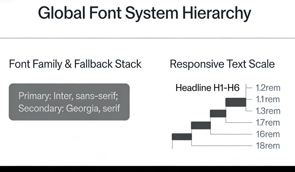
Typography is key to information hierarchy and reading experience. Global font settings establish a complete typographic proportion system from headings to body text.
- Font Family and Fallback Stack ConfigurationDefine primary, secondary, and monospace font families for the entire website. Supports multiple font loading methods, including custom fonts, and automatically generates CSS font fallback stacks compliant with best practices.
- Responsive Text Scaling and Preset StylesDefine specific font sizes, weights, line heights, and letter spacing for different heading levels (H1 to H6), body text, and supplementary text. These settings incorporate built-in responsive logic to ensure appropriate visual proportions across both mobile and desktop devices. Once created, these text styles function as presets that can be directly applied to any text block.
II. Achieving Consistency in Spacing Systems and Layout
Consistent spacing and layout rhythm form the foundation for creating professional visual order and balance. Nexter Blocks' global spacing system turns this concept into a tool.
2.1 Establishment of Standardized Spacing Dimensions
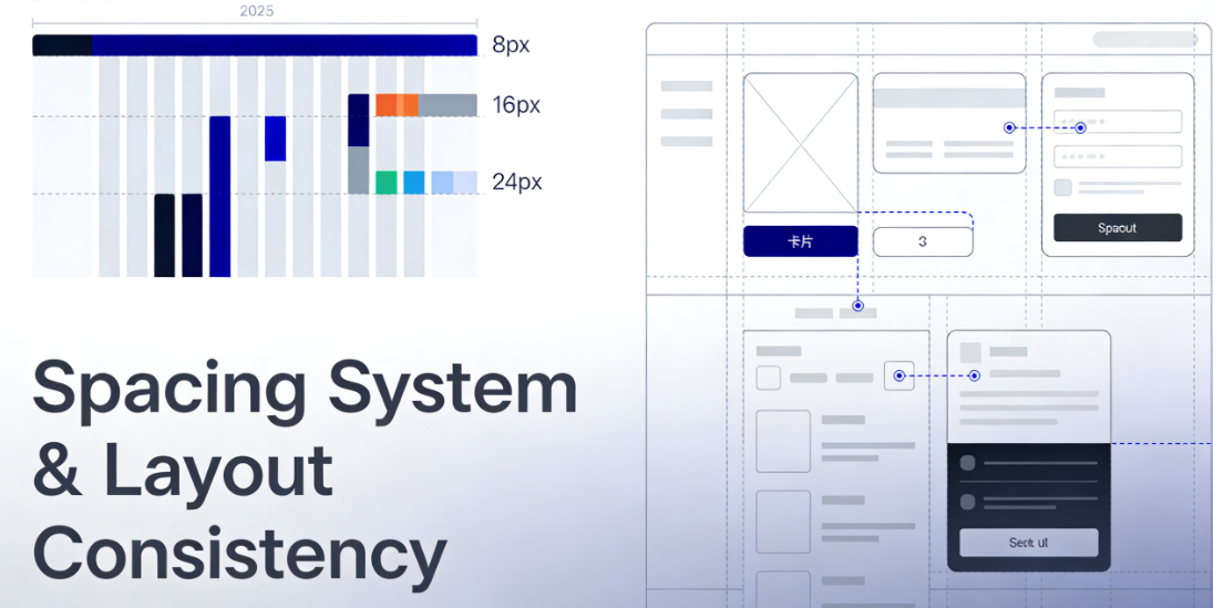
Modern design systems commonly adopt spacing scales based on base units (such as 4px or 8px as the base).
- Scale Definition for SpacingIn global settings, you can define a series of spacing dimensions (e.g., Small: 16px, Medium: 24px, Large: 32px, Extra Large: 48px). These dimensions become the default values for all blocks.Inner and outer marginsOptional values for gap adjustment.
- Control Constraints and Visual HarmonyWhen selecting dimensions for block margins, section gaps, or column spacing, the editor controls typically offer preset options derived from the global scale system. This encourages designers to choose from established systems rather than arbitrarily inputting values. Such constrained design forcibly ensures a unified spatial rhythm throughout the entire site.
2.2 Global Layout Control for Containers and Blocks
To unify the overall page framework structure, global styles are also extended to layout containers.
- Maximum Width Setting for Website ContentDefines the standard maximum width for the main content area of a website. This setting applies to container blocks across the entire site, ensuring consistent width for the main page content.
- Block Presets and Default StylesYou can create and save commonly used block combinations (such as article cards with specific margins, backgrounds, and heading styles) and define them as reusable "preset blocks" or "patterns." These preset blocks adhere to global style variables and serve as efficient tools for quickly building consistent interfaces.
III. Advanced Applications: Systematic Management of Theme Modes and Responsive Design
The power of global styles becomes even more evident when addressing complex design requirements, particularly dark mode adaptation and multi-device responsive design.
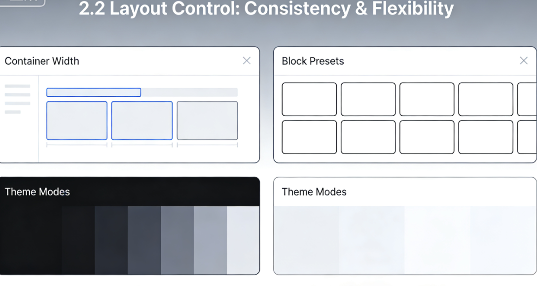
3.1 Global Configuration of Theme Modes (e.g., Dark/Light Mode)
With the widespread adoption of operating system-level dark mode, website support for theme switching has become a key benchmark for enhancing modern aesthetics.
- Dual-Theme Variable DefinitionThe global style system allows separate color variable values to be defined for "Light Mode" and "Dark Mode." For example, the "Primary Background Color" is defined as white in Light Mode and dark gray in Dark Mode.
- Auto-Switching and Block SupportAfter enabling theme mode, all blocks utilizing global color variables will automatically adjust their styling based on the user's system preferences or the site's theme switcher. This eliminates the need to write and maintain extensive CSS overrides specifically for dark mode, enabling systematic theme management.
3.2 Global Consistency of Responsive Breakpoints
Style adjustments for different screen sizes are also part of the design system.
- Breakpoint-aware style settingsWhen defining global font sizes, spacing dimensions, or container widths, you can directly configure different values for various responsive breakpoints (mobile, tablet, desktop). For example,H1 HeadingOn desktop, it is 48px; on mobile, it automatically adjusts to 32px.
- Define once, respond globallyOnce defined at the global level, these responsive rules ensure that any element using the corresponding style variable inherits its responsive behavior. This guarantees consistent responsive logic across the entire site and streamlines maintenance, eliminating the need to individually adjust breakpoint styles for each page or block.

Conclusion: The Efficiency Revolution from Style Management to Design Operations
Nexter Blocks' global styling feature is far more than a convenient settings panel—it represents a paradigm shift that deeply integrates systematic design thinking into the website development workflow. It liberates designers from repetitive, tedious pixel alignment and code inspection, allowing them to focus instead on higher-level creativity and brand storytelling. For development teams, it reduces technical debt and style conflicts; for content managers, it lowers maintenance barriers while ensuring output quality; for the brand itself, it serves as the cornerstone for maintaining precise and consistent digital identity.
By transforming foundational elements like color, typography, and spacing into manageable centralized variables, a website evolves from a static collection of pages into a living, iterative organism that maintains intrinsic consistency. Investing in such design system practices yields returns that extend beyond multiplied production efficiency—it solidifies and visibly expresses a brand's professionalism in the digital space for the long term.

Link to this article:https://www.361sale.com/en/81972The article is copyrighted and must be reproduced with attribution.


![Emoji[wozuimei]-Photonflux.com | Professional WordPress repair service, worldwide, rapid response](https://www.361sale.com/wp-content/themes/zibll/img/smilies/wozuimei.gif)
![Emoticon[baoquan] - Photon Wave Network | Professional WordPress Repair Services, Worldwide Coverage, Rapid Response](https://www.361sale.com/wp-content/themes/zibll/img/smilies/baoquan.gif)

 简体中文
简体中文  English
  日本語
日本語  Français
  Español


No comments