


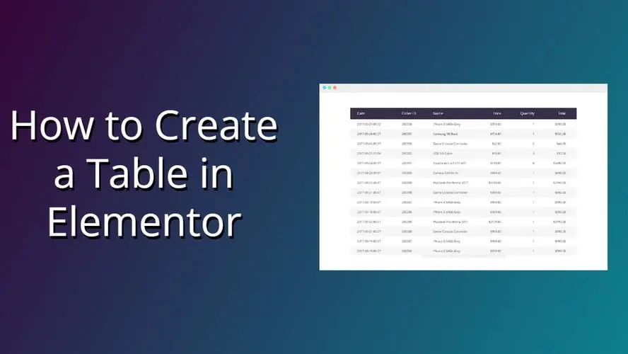
When you use Elementor to make a page to show price comparison, feature list, parameter configuration, course catalog, etc., you will often use "Elementor Table". Many people will simply use the text + column layout stacked together, either not good, or the mobile terminal directly bomb version. In this article, we will start from scratch, how to do Elementor form, how to make it look good, how to take into account both PC and cell phones, step by step to make it clear.
One,What can be done with Elementor tables? Choose the right program first
In Elementor, the "table" is not a separate widget, but is implemented in a combination of ways, with three common approaches:
- Column Layout Analog Tables
- Building rows and columns with Section + Columns
- Each cell is filled with Text Editor, Icon, and Button components.
- Ideal for small amounts of data, price comparisons, feature comparison pages
- Third Party Forms Plugin + Elementor Shortcode
- Build tables with plugins like TablePress, WP Data Tables, etc.
- Inserting Shortcode Widget Calls in Elementor
- For "real data tables" with large amounts of data that need to be sorted/searched/paginated.
- Template + Repeater (advanced play)
- Using Elementor Pro + Custom Fields (e.g. ACF)
- Generating Dynamic Forms with Loop / Repeater
- Ideal for frequently updated product listings, article statistics, lesson plans, etc.
The two most practical sets will be highlighted later:
- Pure Elementor Column Layout for Beautiful Lightweight Tables
- Third-Party Forms Plugin with Elementor for Functional Data Forms
Think before you start: What is this Elementor form for?
Think through these questions before you start dragging components:
- What type of data is displayed?
- Comparison information (packages, features, versions)
- Parameter list (configuration, specifications, dimensions)
- Timeline/progress (curriculum, schedule of activities)
- Where do users focus their reading?
- Is it meant to be a quick side-by-side comparison?
- Or do you browse line by line?
- Does it need to be sorted and searched?
- What is the percentage of devices accessed?
- Elementor forms must prioritize adaption if mobile is a high priority
- Complex multi-column table, it is recommended to use a third-party table plug-in directly more worry-free
In short:
- Not a lot of data, value design sense → Elementor column layout to make "visual table".
- More data, emphasis on maneuverability → Use plug-ins to make "functional forms", Elementor is responsible for layout and packaging.
III. Use of Elementor Column Layout for Basic Tables(suitable for small amounts of data)
1. Creating Sections and Columns
- Create a new Section in the Elementor edit page.
- Choose the number of columns as needed, for example:
- 3 Columns: Comparison of packages suitable for three grades
- 4 columns: suitable for multi-version feature comparisons
- This is set in the Layout of the Section:
- Content Width: Boxed or Full Width, depending on overall design
- Column spacing: set to "Narrow" or customized to avoid columns being crowded together

2. Setting up header rows
- Add an Inner Section at the top of each column or just put a Heading.
- As the "header" of the column, for example:
- Program Name (Basic / Standard / Advanced)
- Category name (parameter, function, description)
- Unify in Style:
- background color
- Font size, font weight
- top and bottom padding (to make the table header look more "blocky")
By making the header color slightly darker and more contrasting, the Elementor form as a whole will immediately have a sense of structure.
3. Adding content lines
Each row can be built as such:
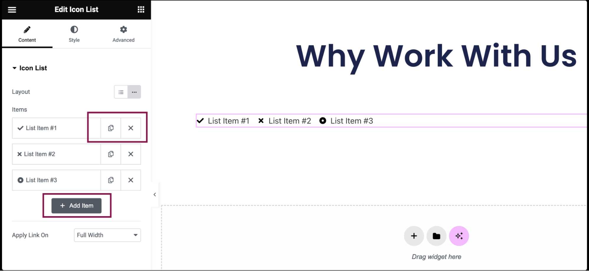
- Add Text Editor or Icon List
- Ensure that the content in the same line is stylistically uniform, for example:
- Icon List with small icons for all of them
- Or all in plain text with a short description
- Use Elementor's copy-and-paste style feature:
- First set up the style of a column
- Then right-click to "Copy Style" and paste it into the other columns of the component.
This will maintain a uniform visual style of the form faster.
4. Add emphasis and guidance
One of the common uses of Elementor forms is to "highlight a recommended option":
- Add to the center column:
- Different background colors
- Bigger shadows
- More visible buttons (e.g. "Most Popular" "Recommended Programs")
- Utilizes Badge / Small Label text descriptions:
- "Suitable for novices."
- "Best value for money"
These can be realized with Heading + small fonts or Icon Box, which looks like a comparison page but is actually a flexible Elementor table.
Fourth, with a third-party form plug-ins + Elementor to do functional data forms
If sorting, searching, and paging are required, it is recommended to consider:
- TablePress
- WP Data Tables
- Ninja Tables
These plug-ins are specialized for data tables and are then called via Shortcode in Elementor.
1. Use plug-ins to build tables
- New form in the plugin backend
- Adding columns, rows and fields
- Enable: search box, sorting, paging, etc.
- Record the Shortcode generated by the plugin (e.g.
[table id=1 /])
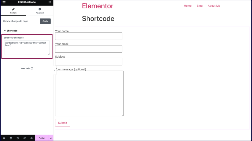
2. Inserting tables in Elementor
- exist Adding Shortcode Widgets to Elementor
- Paste in the Shortcode above
- Sets the peripheral section:
- maximum width
- inner margin
- Background color (e.g. light gray)
- You can add headings and explanatory text to complete the paragraph with the table.
The benefits of doing this:
- Centralized back-end management of form data and modification of one site-wide update
- Ajax search, sorting experience is stronger than pure Elementor column layout
- Suitable for technical documentation, price lists, parameter lists, course schedules, etc.
V. Let Elementor forms are beautiful and easy to use.design skills
1. Controlling column widths to avoid overcrowding
- Minimize layouts with more than 5 columns
- Use fewer long sentences for text-based content, instead using phrases or sub-paragraphs
- Use bolding and icons for important information to reduce reliance on text stacking
2. Contrasting colors and spacing
- Slightly darker background color in table header, simple and clean data area
- Rows can be alternated with lighter colors (pseudo "zebra" effect, can be simulated with Section + Inner Section)
- Ensure that each cell has enough padding to make the table look like it's "breathing".
3. Pay attention to the mobile experience
- Switching to mobile view in Elementor's Responsive settings
- Check:
- Whether the text is crowded together
- Are the buttons too small to be easily clicked
- Whether too many columns result in a poor horizontal scrolling experience
- If necessary:
- Change the multi-column layout to vertical stacking on mobile
- Or use two structures: a "side-by-side comparison table" for PC and a "card list" for mobile.

Link to this article:https://www.361sale.com/en/81815The article is copyrighted and must be reproduced with attribution.


![Emoji[wozuimei]-Photonflux.com | Professional WordPress repair service, worldwide, rapid response](https://www.361sale.com/wp-content/themes/zibll/img/smilies/wozuimei.gif)
![Emoticon[baoquan] - Photon Wave Network | Professional WordPress Repair Services, Worldwide Coverage, Rapid Response](https://www.361sale.com/wp-content/themes/zibll/img/smilies/baoquan.gif)

 简体中文
简体中文  English
  日本語
日本語  Français
  Español


No comments