


Creating a truly professional Elementor form requires systematic optimization from color scheme, borders, spacing, fonts to responsive structure, not just modifying a single style. This article will focus on "Professional Elementor Forms" unfolds to provide clear, actionable, and logically complete optimization strategies to help you quickly improve the visual presentation and readability of your forms.

One,for what reason?Creating Professional Elementor FormsImportant?
In a website, tables take on the important tasks of conveying information, organizing data and enhancing the structure of the content. If the table layout is confusing or improperly color-coordinated, the cost for users to access information will increase significantly, thus affecting the reading experience. Therefore.Creating professional Elementor forms is not just a visual requirement, it's also a key factor in improving user retention and SEO performanceThe
A professional Elementor form usually has the following characteristics:
- Uniformity of color scheme and clear contrasts
- Well-spaced lines and smooth reading rhythm
- Clear, uncluttered border detail
- Clear font hierarchy and easy-to-understand information structure
- Consistency between mobile and desktop experience These core elements together form a professional visual presentation and are the focus of the subsequent analysis in this article.
Two,How do professional Elementor forms achieve uniformity in their color scheme?
Color matching is one of the core factors in the visual quality of a form. Professional Elementor forms often follow a consistent color logic, allowing readers to quickly capture key information while maintaining a consistent overall style on the page.
2.1 Methods of matching primary, secondary and background colors
The color matching optimization focus consists of three parts:
- Primary color: consistent with the brand's vision, such as button color or logo color
- Secondary colors: used to emphasize table headers or special rows and columns
- Background color: used to enhance the content hierarchy and avoid page visual fatigue

2.2 Effect of Color Contrast on Reading Experience
ground WCAG readability criteriaThe contrast ratio between text and background is recommended to be at least 4.5:1 to ensure that users can read it clearly on different devices. Applying this principle to professional Elementor forms can significantly optimize text legibility, e.g. dark grey text against a light grey background is softer and more modern than pure black against pure white.
Three,How do professional Elementor forms optimize border performance?
Borders are the backbone of a form's structure. To create professional-looking Elementor tables, you must make your borders simple, clean, and hierarchical.
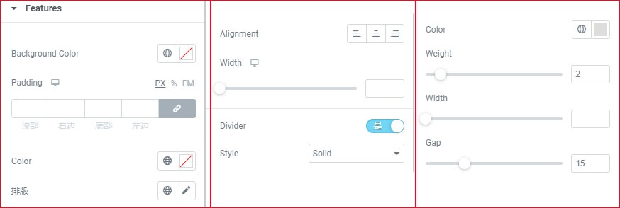
3.1 Border thickness, color and transparency adjustment strategy
The borders of professional forms usually have the following characteristics:
- Low saturation of border color, e.g. #E5E5E5
- Control the thickness between 1px-2px.
- The outer frame is slightly darker than the inner lines, reinforcing the visual structure
This approach will give the table both a separating effect without looking harsh.
3.2 Using spacing instead of excessive borders
Excessive borders cause "visual noise". In professional Elementor forms, you can adjust the visual breathing by using internal padding, for example:
- Cell padding: 12-18px
- Table header padding: 16-20px Keeps the data visually separated and clear, rather than relying on lots of border lines.
Four,Spacing and Typography: A Must for Professional Elementor Forms
The spacing of tables is key to readability. If the spacing is uneven, the entire table will look cluttered. When creating professional Elementor tables, pay special attention to the following points.
4.1 Uniform internal margins to focus information
The table widget can be accessed via Elementor's Table Widget or theRelated plug-insThe customizable padding of each cell makes the contents of the table neater and makes the reading experience more stable.
4.2 Typographic hierarchy of table headers, table bodies and emphasized rows
Table headers are usually required:
- larger font
- coarser weighting
- darker color
The content of the table body maintains a uniform style, emphasizing the rows can use a light background color or bold to highlight the key points, to enhance the sense of professionalism.
Five,Fonts and Text Alignment: The Core Expressions of Professional Elementor Forms
The role of fonts in the communication of information is crucial.A professional Elementor form must have a uniform and standardized text system.The
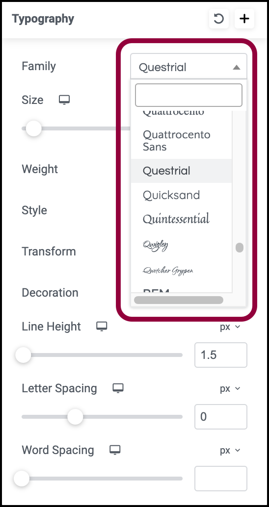
5.1 Font size and weights should be consistent with the hierarchy
Common Configuration Examples:
- Header: 15-16px / 600 weights
- Table body: 14px / 400-500 weights
This can make the content look stable and more logical.
5.2 Text alignment affects the reading path
The text in the table is usually used:
- right justification of numerals (computing)
- left justification of text (computing)
- Center-aligned table headers
This type of layout makes it easy for users to quickly scan information and is an important principle when creating professional Elementor forms.
Six,Responsive Optimization: The Key to Determining Whether an Elementor Form is Truly "Professional" or Not
Many users report that forms don't look good on mobile, so responsiveness is an integral part of professional Elementor forms.
Optimization methods include:
- Add larger padding to mobile cells
- Enable horizontal scrolling instead of forcing text compression
- Use of collapsed table structures (depending on the level of plugin support)
- Adjust font size (e.g. use 13px-14px for mobile)
A form is truly a professional Elementor form if it is still well structured on a cell phone.

Link to this article:https://www.361sale.com/en/82227The article is copyrighted and must be reproduced with attribution.


![Emoji[wozuimei]-Photonflux.com | Professional WordPress repair service, worldwide, rapid response](https://www.361sale.com/wp-content/themes/zibll/img/smilies/wozuimei.gif)
![Emoticon[baoquan] - Photon Wave Network | Professional WordPress Repair Services, Worldwide Coverage, Rapid Response](https://www.361sale.com/wp-content/themes/zibll/img/smilies/baoquan.gif)


No comments